A short history of the print, from woodblock to giclée
Six ways of putting an image on paper, from a carved block in 1400s Europe to the inkjet print on your wall, and what each one still means when you buy one.
Contents7 sections
- Woodcut: the first print was a block
- Copper engraving and etching: the line goes down, not up
- Mezzotint and aquatint: copper learns to print tone
- Lithography and chromolithography: drawing on stone
- Photomechanical reproduction: the plate becomes a photograph
- Giclée: the inkjet era
- What this means when you buy a print today
Every print on this site is a descendant of one of six ideas. Cut the picture into a block and ink what stands proud. Cut it into copper and ink what sinks. Bite it with acid. Draw it on stone with grease. Photograph it. Spray it. Each idea was a technology before it was an art, and each one changed what ordinary people could own. This is the short version of that story, told through the sheets we restore: a wave cut in cherry wood, a heart engraved in Rome in 1552, a turkey etched in London, a skull printed in colour in Munich, and a painting that passes through a scanner on its way to your wall.
Woodcut: the first print was a block
The woodcut is the oldest way of printing a picture and the simplest to explain. The artist draws on a plank cut along the grain, then cuts away everything that should stay white. What is left standing takes the ink. Paper goes on top; pressure transfers the image. Tate puts woodblock printing in Europe from the twelfth century, first for textiles, with images on paper following by the late fourteenth century. By the 1400s the block print was how a pilgrim bought a saint, a gambler bought a playing card and a reader of the first printed books got a picture beside the type.
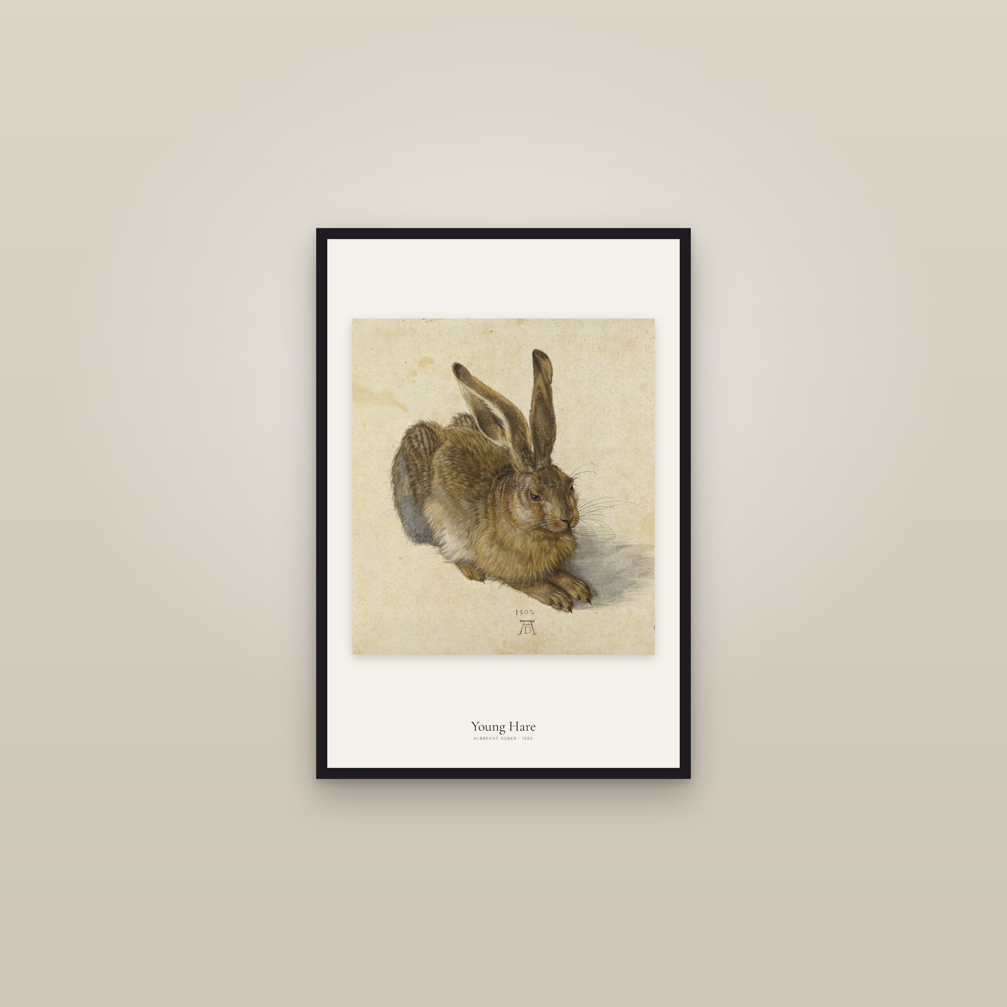
The craft peaked early. Albrecht Dürer, a goldsmith's son from Nuremberg, made woodcuts in the 1490s and 1500s that nobody has bettered for density of line, and sold them across Europe. That is the other half of the woodcut's importance: it was the first art that travelled by the hundred. We do not hold Dürer's prints (his great works on paper are mostly in Vienna and in library print rooms), but his watercolour Young Hare of 1502, in the Albertina, is here, and it shows the same eye that made the prints: every hair accounted for.
Japan took the block further than anyone
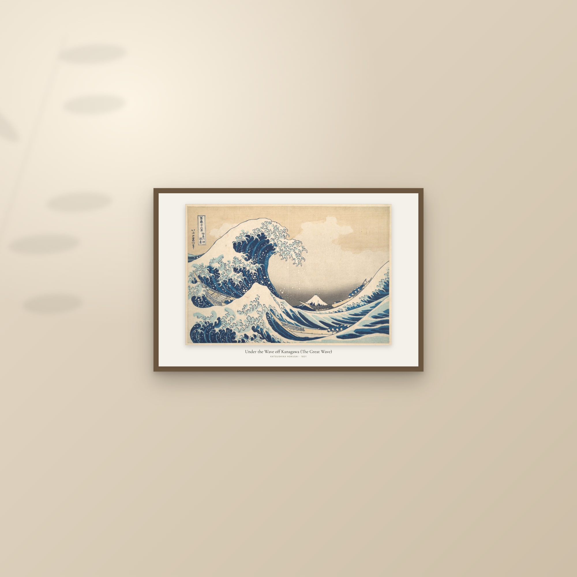
Two hundred years after Dürer, the woodblock had its second life in Edo, the city now called Tokyo. The ukiyo-e print was a commercial product from the start: a publisher commissioned a design, a carver cut the blocks, a printer pulled the sheets, and the artist's name sold them. The early prints were black outlines, hand-coloured. From the 1760s the trade perfected the nishiki-e, the "brocade picture": a key block for the outlines and a separate block for each colour, printed one after another in exact register, with the sheet laid face down and rubbed from the back with a pad. No press. The pressure was a human hand, which is why a good impression carries a faint relief where the block pushed into the paper.
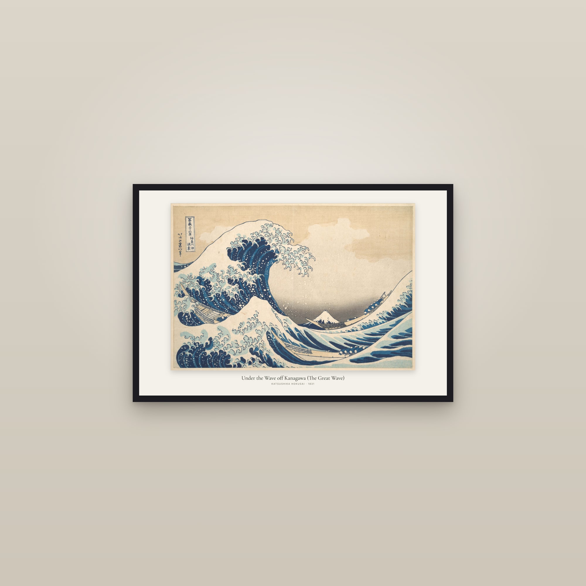
Hokusai's Under the Wave off Kanagawa, from the series Thirty-six Views of Mount Fuji, is the summit of that system. The Met's record dates it to about 1830–32, and the Met's essay on the print notes that the publisher advertised the series at the New Year of 1831 as printed in Prussian blue, a pigment newly available for prints, and that the printers layered indigo under it to deepen the darkest blues without dulling them. It was a commercial edition pulled in large numbers, which is why the Great Wave exists in many museums, and why its impressions differ: the Art Fund's note on the British Museum's 2008 purchase describes it as one of the twenty or so best surviving sheets, with the woodgrain of the sky block still visible. When you buy a Great Wave, you are choosing an impression, not a painting. Ours is restored from the Metropolitan Museum's.
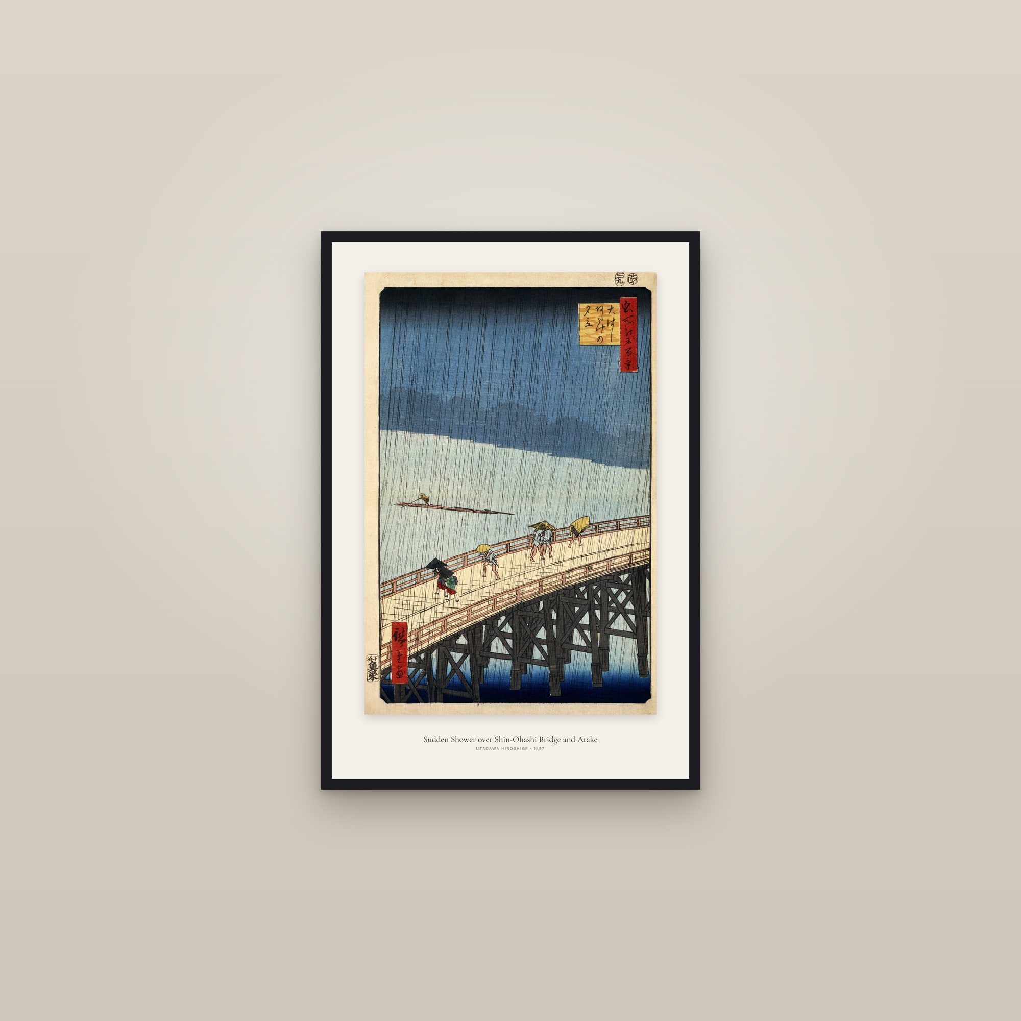
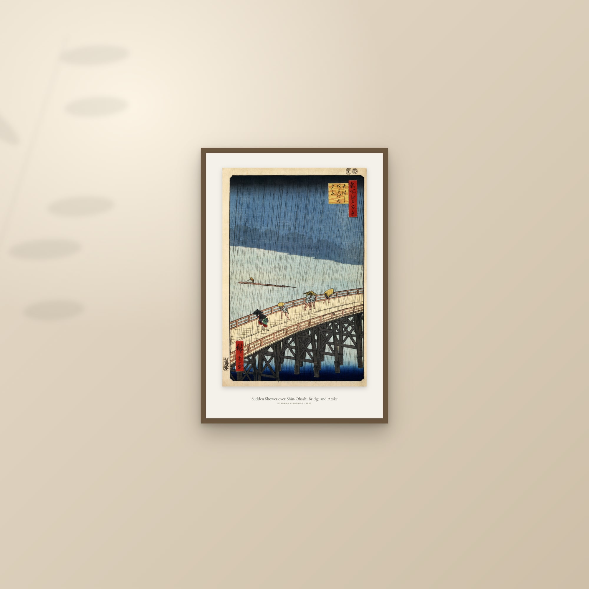
Hiroshige, the other name every buyer knows, pushed the medium's atmosphere rather than its drama. Sudden Shower over Shin-Ōhashi Bridge, from One Hundred Famous Views of Edo, prints rain as a lattice of fine lines from one block over a graded wash from another. Van Gogh copied it in oil in 1887; his Bridge in the Rain is in the Van Gogh Museum. The whole series, and the two great road series, are in our ukiyo-e collection.
Copper engraving and etching: the line goes down, not up
Around 1430, in Germany, someone realised that a copper plate incised with a burin could be inked, wiped, and printed under pressure, so that the ink in the grooves transferred to damp paper. Tate dates the first engraved prints to about 1430 in Germany. The burin is a steel rod with a lozenge-shaped tip; pushed through copper it raises a curl of metal and leaves a V-shaped groove that swells and thins with pressure. That is the signature of an engraving: lines that taper. Etching, which Tate says was probably not used for printmaking much before the early sixteenth century, lets acid do the cutting. The plate is coated with wax, the artist draws through the wax with a needle, and the acid bites where the copper is bare. Etched lines are freer; engraved lines are more controlled. Most "engravings" you meet in old books are both, on the same plate.
The anatomical atlas is where copper did its most important work, and it is a story of three books.
Vesalius, 1543: the book that fixed the body in woodcut
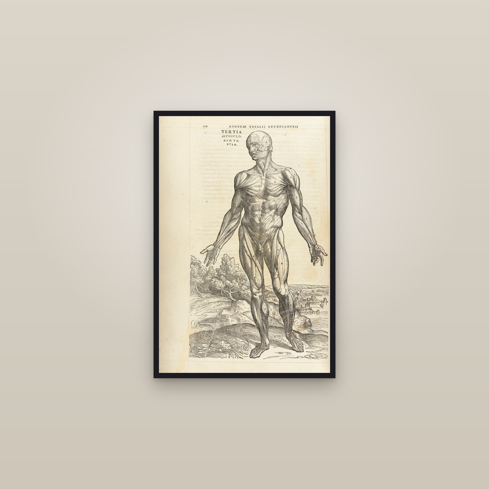
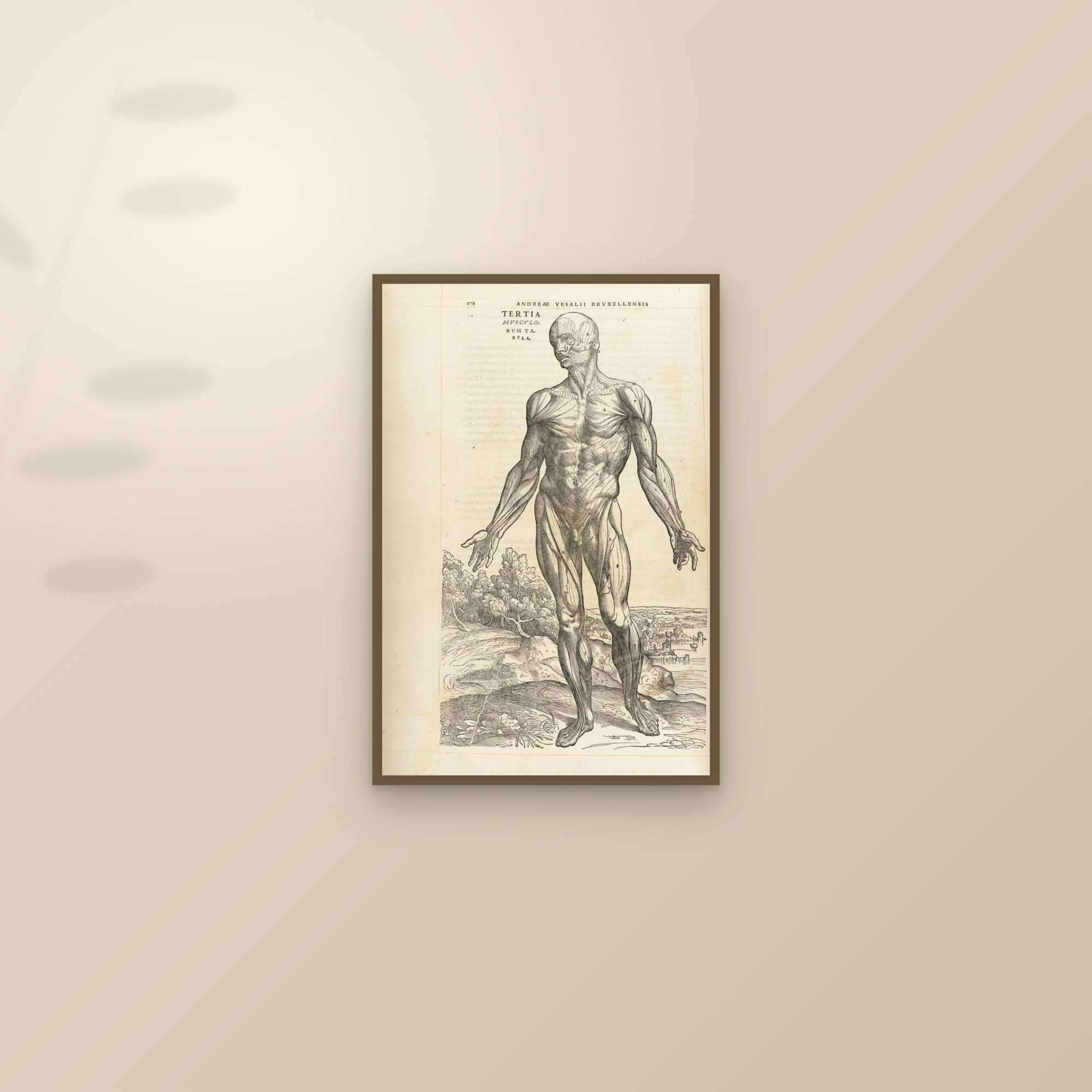
Before copper took over, the greatest anatomy book was a woodcut book. Andreas Vesalius, professor of anatomy at Padua, had De humani corporis fabrica libri septem printed by Johannes Oporinus in Basel in 1543. The National Library of Medicine's account says the famous "muscle men" were long credited to Jan Stephan van Calcar and are now thought to be the work of several artists, known collectively as the workshop of Titian. The figures stand in a landscape, flayed layer by layer, and they were copied for two centuries. Our Third Muscle Man is restored from a 1543 impression: the line is woodcut line, bolder and flatter than anything that follows.
Eustachi, 1552 and 1714: engraved in one century, printed in another
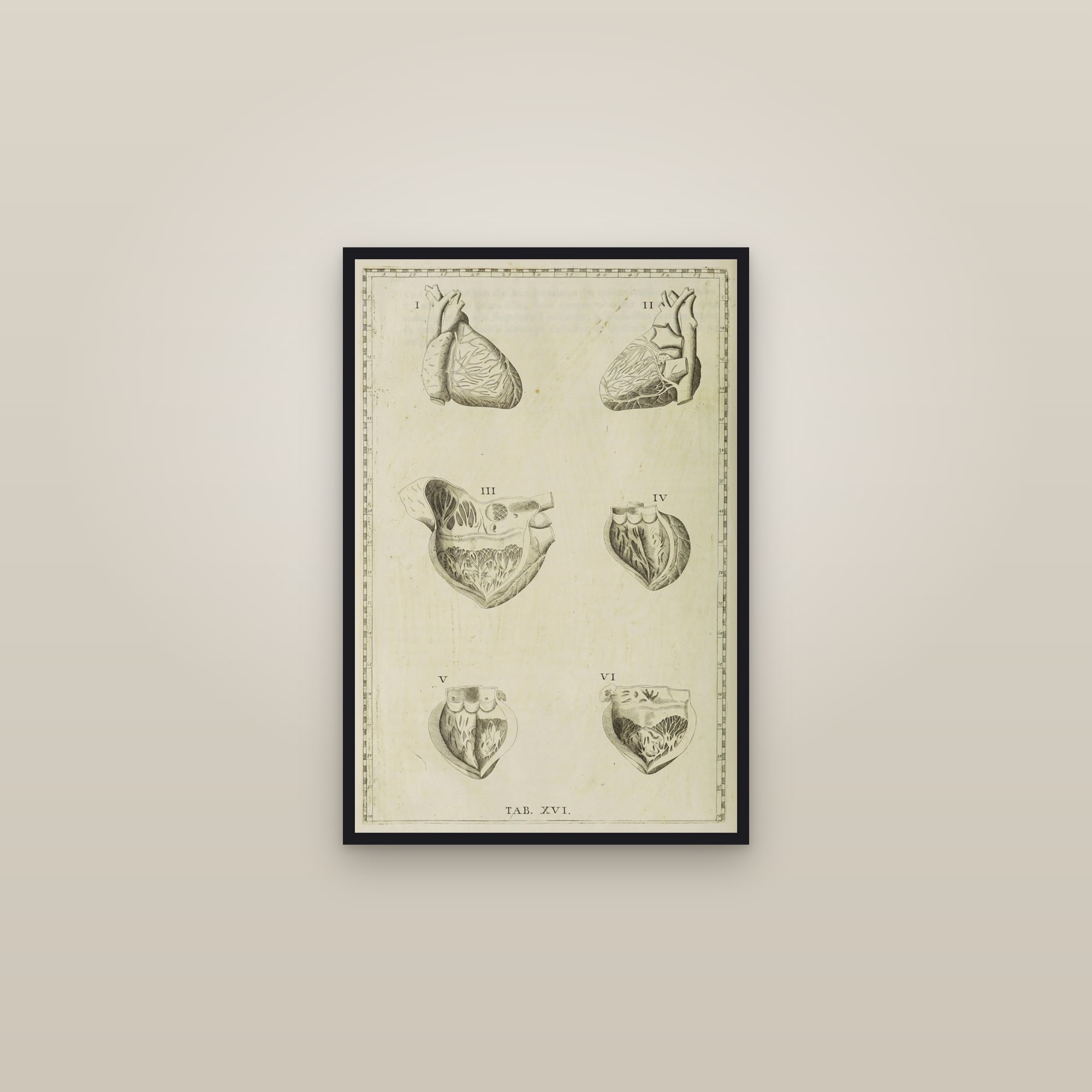
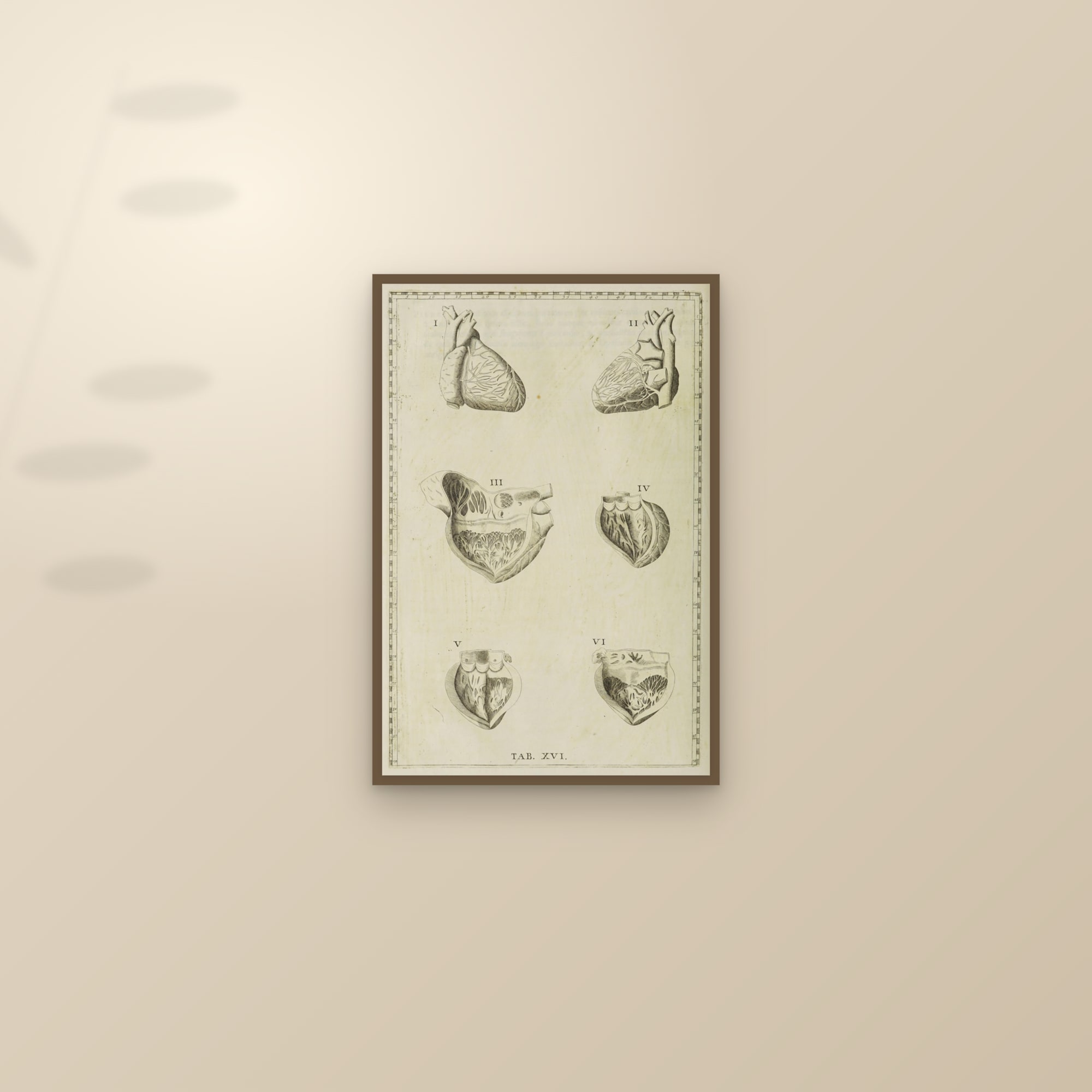
The strangest publishing history in anatomy belongs to Bartolomeo Eustachi. In 1552, in Rome, he and the artist Pier Matteo Pini drew a set of plates, and Giulio de' Musi engraved them on copper. Only eight were published in Eustachi's lifetime, in his Opuscula anatomica of 1564. The rest, thirty-eight plates according to the National Library of Medicine, sat unpublished for a century and a half until the papal physician Giovanni Maria Lancisi found them, wrote his own commentary, and printed them in Rome in 1714 as Tabulae anatomicae. The plates carry a feature no one else used: numbered rulers printed down the margins, so a structure could be located by coordinates instead of letters. Look at the edges of our Human Heart or the Nervous System and the rulers are still there. They are copper engravings in the purest sense: burin lines, cut by a Renaissance hand and printed in the Baroque.
Albinus, 1747: the grid and the rhinoceros
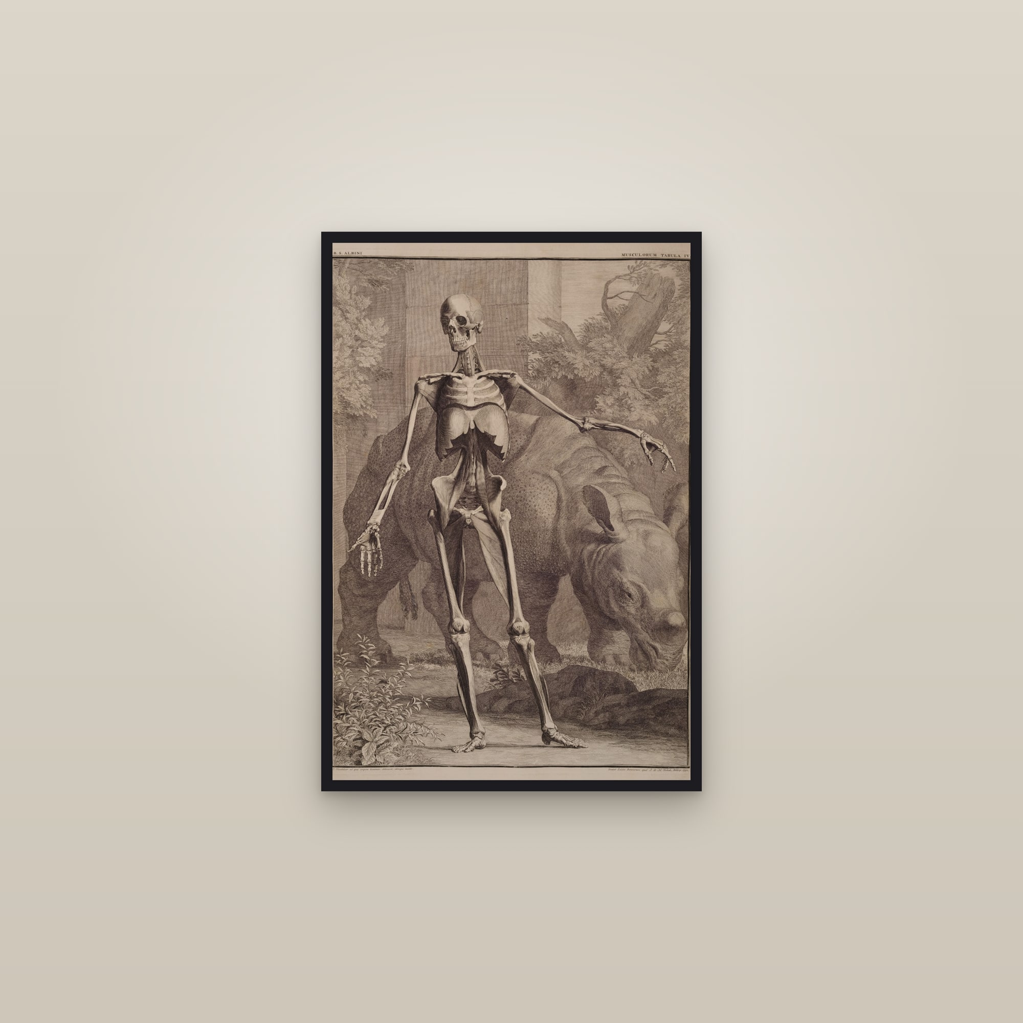
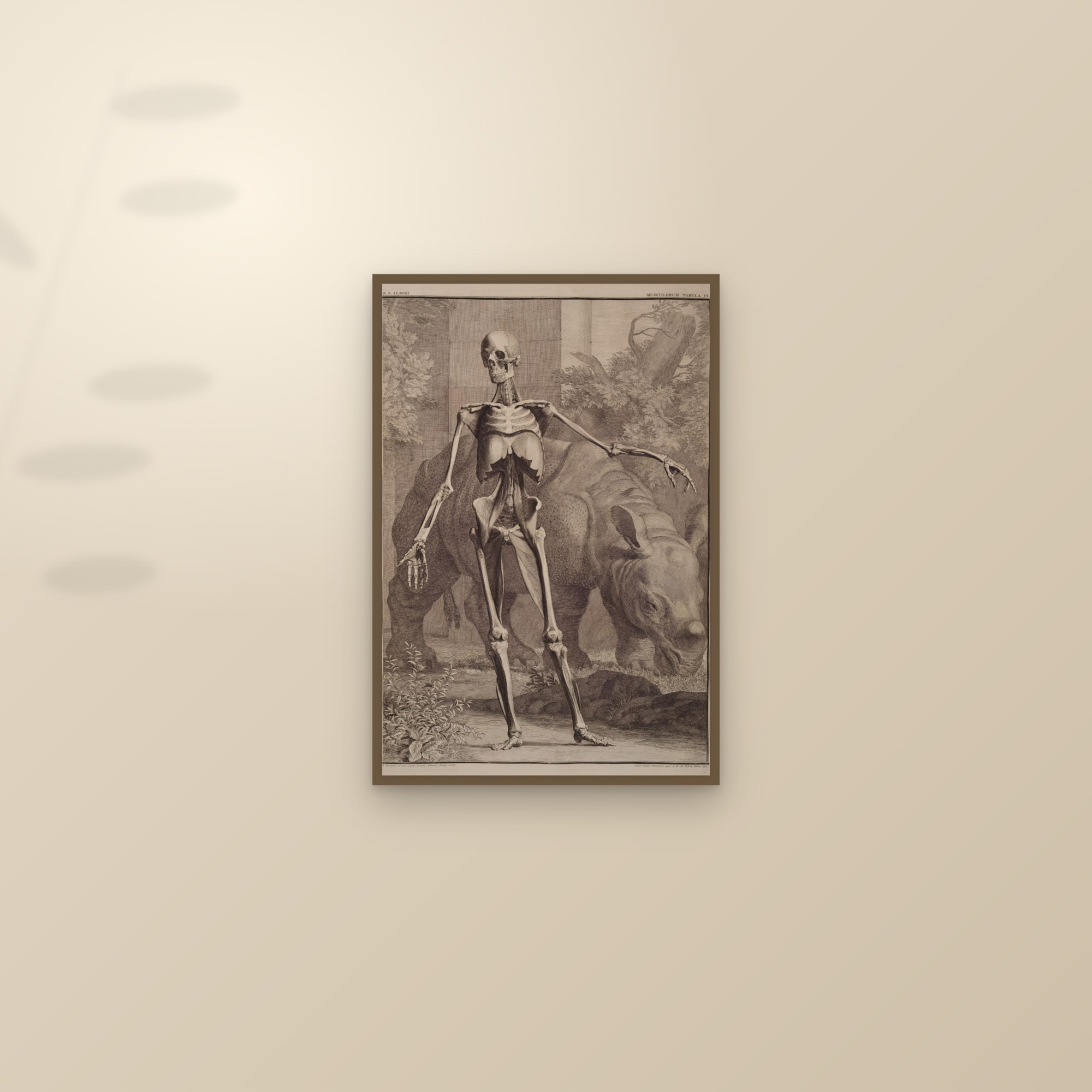
Bernhard Siegfried Albinus wanted anatomy without the artist's guesswork. In Leiden, with the artist and engraver Jan Wandelaar, he published Tabulae sceleti et musculorum corporis humani in 1747, largely at his own expense. The NLM describes their method: nets of square cord were hung at set distances between the specimen and the artist, and the figure was drawn through the grid, square by square. The result is the most measured skeleton ever printed. Wandelaar then set it in a landscape, and behind two of the muscle figures stood a rhinoceros: Clara, the animal that had arrived in Amsterdam in 1741, included, Albinus wrote, because the beast was so rare. Critics attacked the backgrounds; Albinus defended them. Our Fourth Order of Muscles with the Rhinoceros and the skeleton seen from the front show what copper could do by the mid-eighteenth century: etched tone, engraved detail, and a scale of ambition that would not be matched until photography.
All three books, plus Sobotta below, are in our anatomy collection, by body part.
Mezzotint and aquatint: copper learns to print tone
A burin draws lines. To print a sky, a cheek or a feather you need tone, and copper found two ways to it. Mezzotint, developed in the seventeenth century, roughens the whole plate with a toothed rocker until it would print solid black, then burnishes the lights back out; Tate notes it became the English way of reproducing portrait paintings in the eighteenth century. Aquatint, developed in France in the 1760s, dusts the plate with resin, heats it so the grains stick, and bites the plate in acid, which eats around every grain and leaves a field of tiny pits that print like a wash. Varnish stops out the whites; longer biting makes darker tones.
Audubon's Birds of America: aquatint at the scale of life
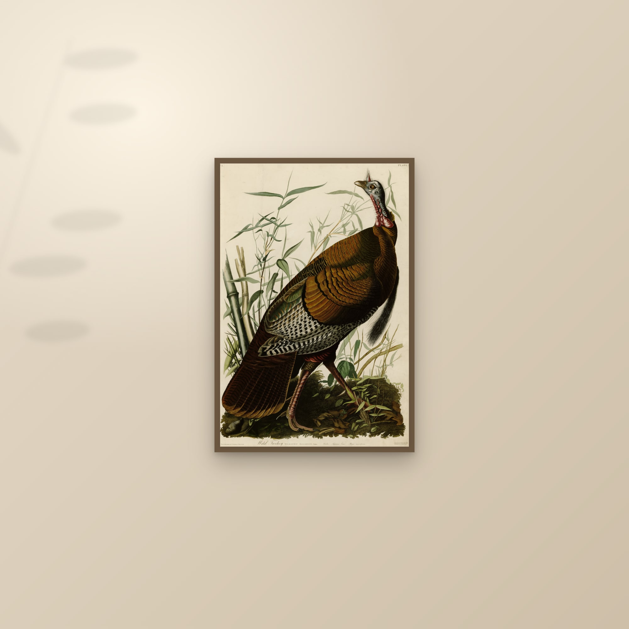
The greatest aquatint book is American in subject and English in manufacture. John James Audubon painted the birds of North America at life size and could find no one in America to print them. In 1827 he engaged Robert Havell Sr and Jr in London. The Linda Hall Library's account is the one to trust: Havell Jr etched and engraved the outlines and worked the tone in aquatint, Havell Sr printed the plates and had each impression coloured by hand, and over eleven years, to 1838, the younger Havell produced 425 of the work's 435 plates (the first ten had been begun in Edinburgh by William Lizars). The sheets were double-elephant folio, roughly 26 by 38 inches, so that a Wild Turkey could be shown at its actual size. Every plate is listed in our Birds of America reference, by Havell number, and the Audubon collection holds the restored prints.
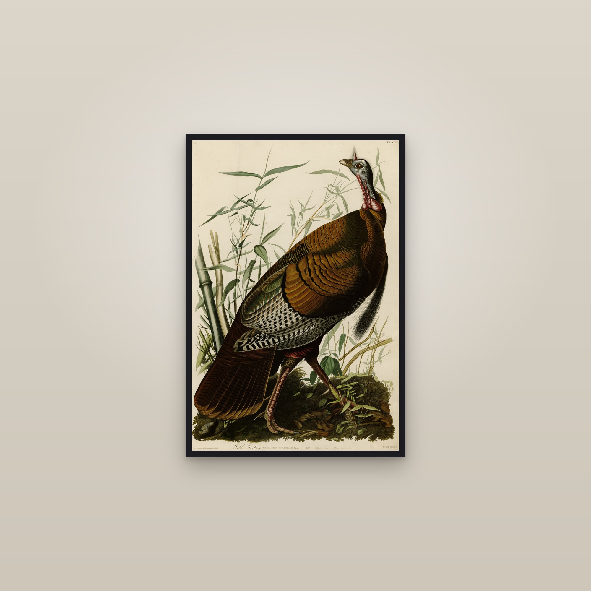
Look closely at a Havell plate and the three techniques sit side by side: engraved line in the beak and feet, aquatint grain in the sky and the shadowed plumage, and the watercolourist's hand over everything. The Snowy Owl is a good one to study because its white feathers are almost all aquatint and paper.
Lithography and chromolithography: drawing on stone
In the late 1790s a Munich playwright who could not afford a printer, Alois Senefelder, worked out that a drawing made in grease on a slab of Bavarian limestone could be inked and printed indefinitely: wet the stone, and the water-holding blank areas refuse the greasy ink while the drawing takes it. The EBSCO account gives 1798 for the process he called chemical printing. It was the first planographic method (nothing cut up or down) and it freed the printmaker from the carver and the engraver. Whatever a crayon could draw, the stone could print.
Colour followed. A chromolithograph uses one stone per colour, printed in register, sometimes a dozen or more; the colours sit on the paper in flat, slightly translucent layers. Nobody made it sing like Jules Chéret. The V&A calls him the father of the poster and credits that title mainly to his pioneering of the colour lithographic process. He set up his own press in Paris in 1866 and went on to produce the dancing women and rainbow skies that papered the Belle Époque: music halls, cabarets, aperitifs. Toulouse-Lautrec and Mucha followed him onto the same walls. (A wave of Belle Époque posters is in preparation; for now the poster idiom lives on this site in our render-native Art Deco line, designed in the 1920s manner and printed, like everything here, as a giclée.)

Sobotta's atlas: colour anatomy for the twentieth century
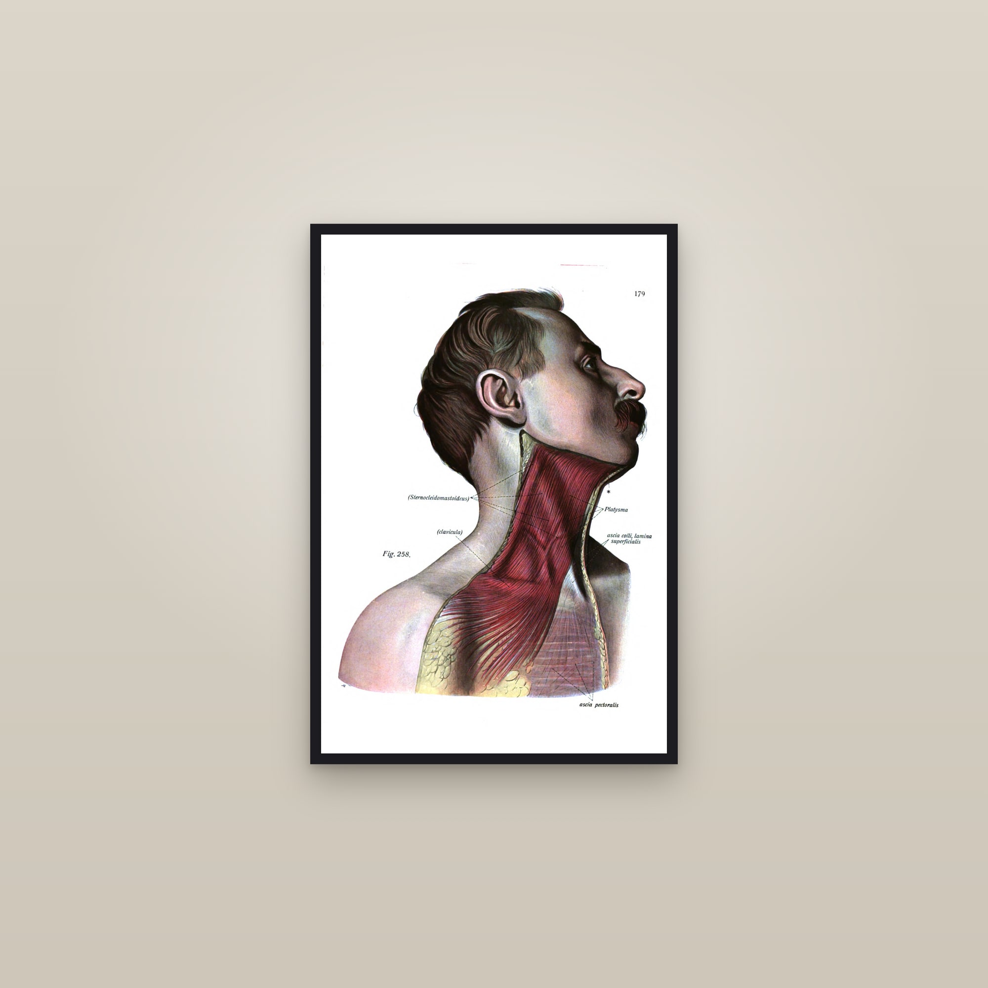
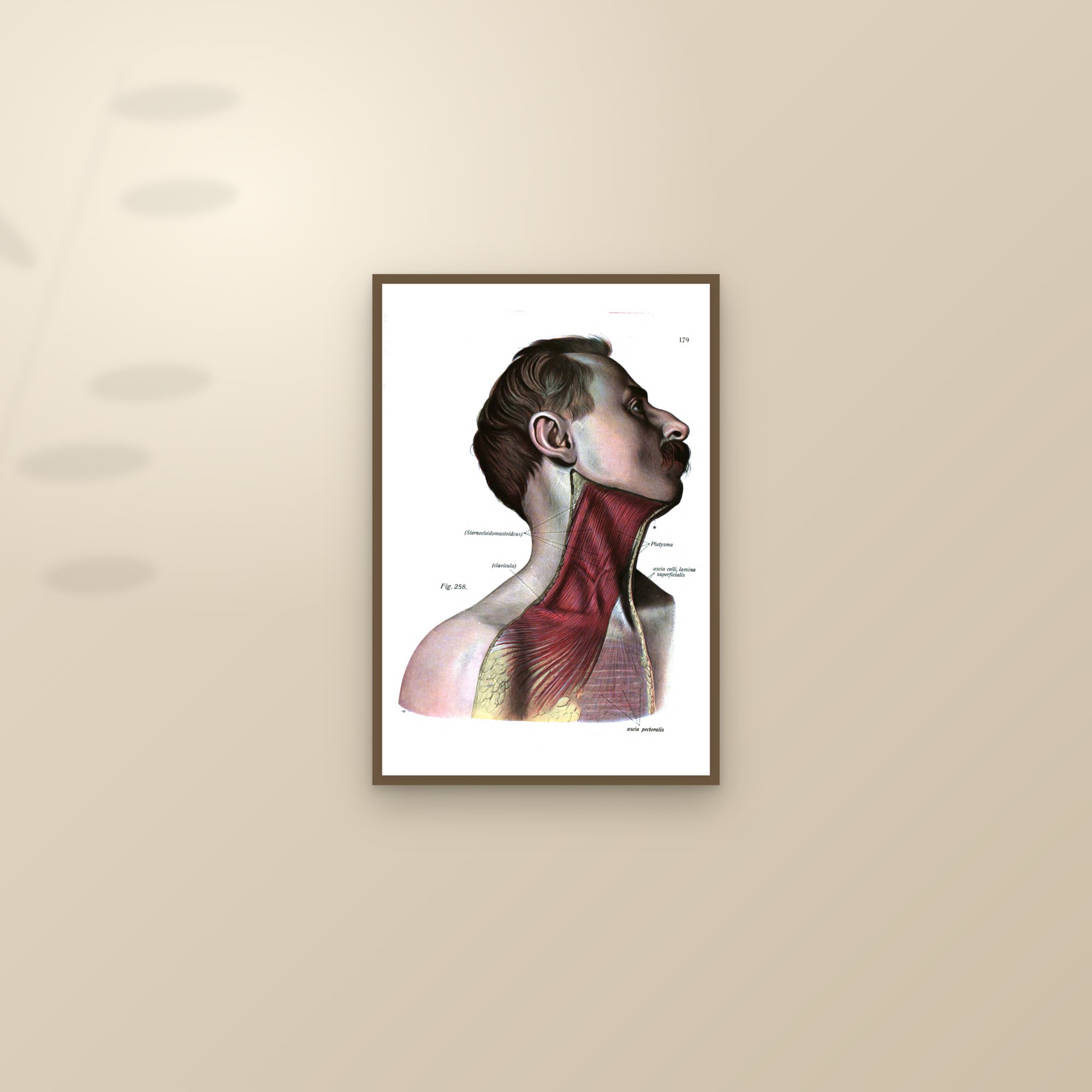
The same colour process reached medicine, and then left it. Johannes Sobotta's Atlas der deskriptiven Anatomie des Menschen first appeared from J. F. Lehmann in Munich in 1904 and became the standard atlas of the century; the plates we restore come from the 1919 and 1920 volumes, which the Internet Archive holds. Sobotta's own prefaces, reprinted in those volumes, tell the printing story exactly. For the first edition he used multicolour lithography, "to my knowledge for the first time for the purpose of anatomical illustration": thirty of the first volume's thirty-four colour plates were drawn on stone. For the second edition of 1913–14 he dropped the lithographic plates and replaced them with three-colour process and multicolour halftone, the camera-and-screen methods of the next section, the muscles coloured by "yellow, red and blue auxiliary plates"; the third edition of 1919–20 kept those plates unchanged. All of them were painted first by Karl Hajek, and that is how they read: the muscles a true red, the nerves a pale yellow, the bone a warm ivory, each colour laid in a flat conventional layer. Set a Sobotta beside an Eustachi, as our heart anatomy page does, and you see two centuries of printing in one pair: black burin line against layered colour.
Photomechanical reproduction: the plate becomes a photograph
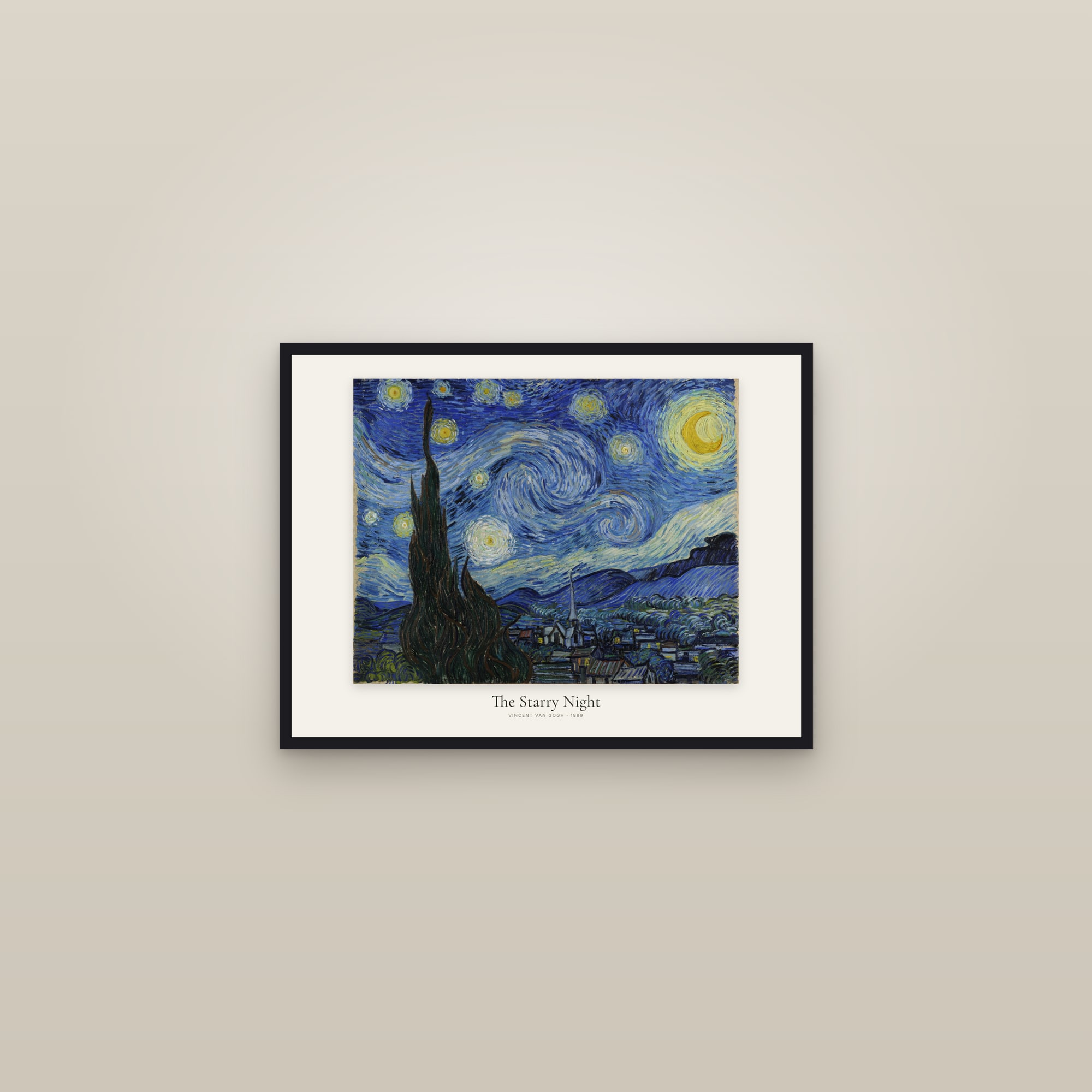
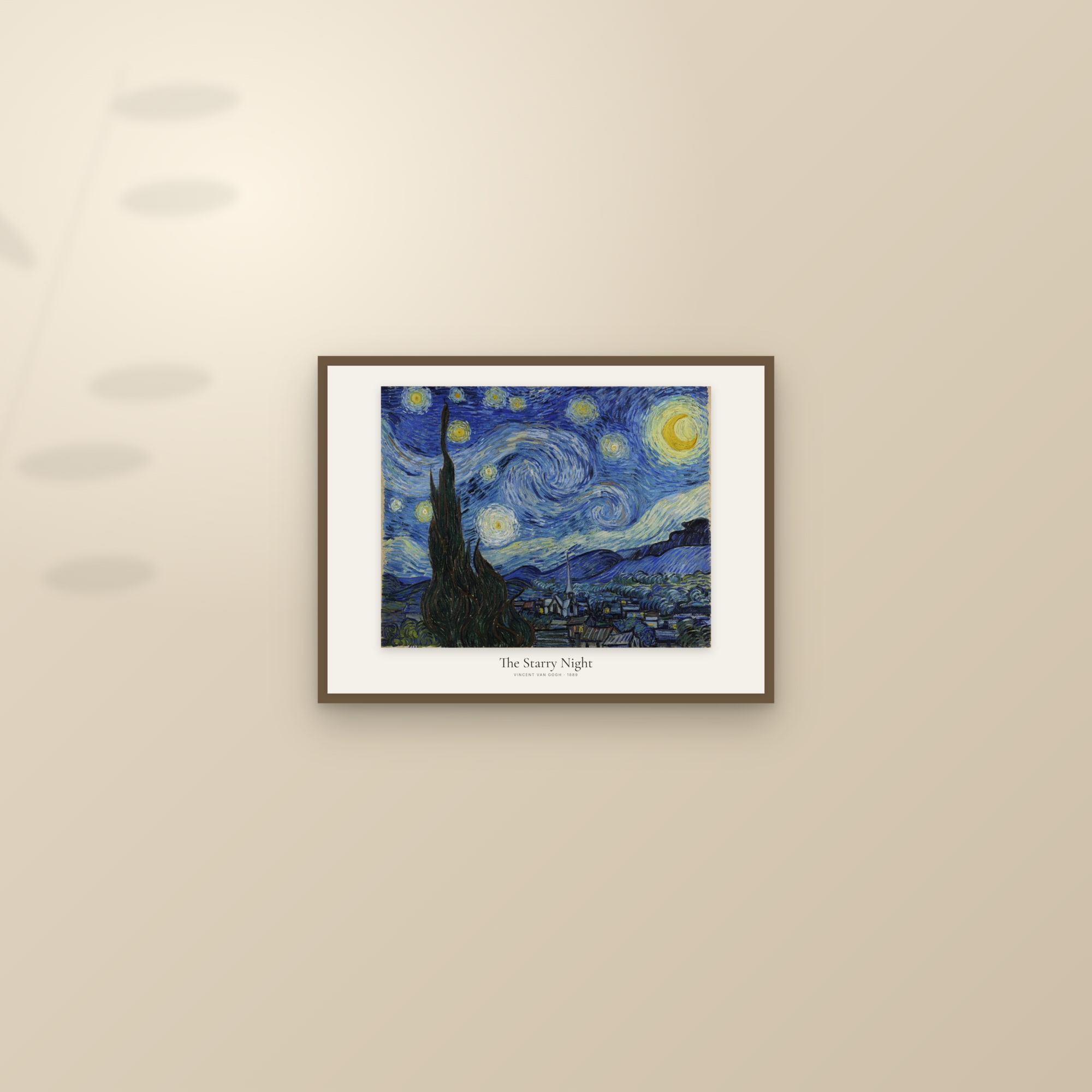
From the 1880s the hand left the plate. The halftone screen broke a photograph into dots of varying size that a relief plate could print; photogravure etched a photograph into copper through a grain, giving the richest tone printing has ever managed; offset lithography, early in the twentieth century, put the lithographic principle onto a metal plate and a rubber blanket and made it fast. By the 1920s a painting could be photographed in colour, separated into four plates, and printed in a magazine. That is the moment the famous painting became famous: the Mona Lisa and the Starry Night most people know are the ones they saw in a printed reproduction, not in Paris or New York. It is also the moment the print stopped being an original and became a copy, and the reason the next word in this story had to be invented.
Giclée: the inkjet era
An inkjet printer sprays droplets of ink from a nozzle. The word giclée is French for exactly that, a spurt or spray, and American fine-art printers adopted it in the 1990s to distinguish their pigment prints on heavy rag paper from the office machine on the desk. The distinction was real. A fine-art inkjet uses pigment inks (particles, not dyes, so they resist fading), more of them than the four in an office machine, on papers made to last, and it reads the whole tonal range of a scan without a screen, a grain or a stone standing between the file and the sheet.
What it does not have is an edition. There is no plate to wear out, no block to crack, no stone to grind down. The run is as long as the demand, and the quality depends entirely on three things: the file, the ink and the paper. That is why the work on this site is in the file. A painting like Van Gogh's Starry Night reaches us as a museum scan, is cleaned of the scanner's edge and the gallery's glare, and is rebuilt as a 7200 by 10800 pixel master at 300 dots per inch before a printer ever sees it.
What this means when you buy a print today
Six centuries of printing leave you with a short checklist.
Know which object you are buying. A giclée of the Great Wave is a photograph of one impression. A giclée of an Eustachi plate is a photograph of one 1714 sheet, rulers and all. Ask which impression and which copy. On this site the product page tells you the museum or library the scan comes from; the Audubon and USDA reference pages give the plate numbers.
Paper is the medium now. Where the stone and the copper once decided the look, the paper does. We print scans of real works, the plates and the paintings, on 250 gsm archival stock with a soft, slightly off-white surface, because that is closer to the rag paper the originals were printed on; our own render-native designs go on a brighter 200 gsm sheet. Both are pigment-printed, both made to order.
Size is honest only if the scan is. A 1714 engraving scanned at 2,000 pixels across cannot be printed at 24 by 36 inches without softening, so we cap each plate's sizes to what its scan can hold. A painting scanned at 8,000 pixels can go large. Prices start from $39 unframed, and framing is black or dark wood, which suits the ink-on-paper origin of most of what is here. Canvas is for the full-bleed works only; a contained engraving with its margins should stay on paper.
An "open edition" is not a flaw. The print trade spent a century inventing scarcity (limited editions, numbered sheets, cancelled plates) because the plate wore out anyway. An inkjet does not. What you pay for is the restoration and the paper, not an artificial number in the corner.
Further reading in the Journal: Japanese woodblock printing explained, copper engraving explained and chromolithography explained each take one chapter of this story at full length. For the paintings that passed through the photomechanical age into fame, start with the most famous paintings in the world.
Japanese Ukiyo-e Prints Anatomy Prints — Antique Anatomical & Medical Plates Audubon Bird Prints — The Birds of America, Framed or UnframedQuestions people ask
What is the difference between a woodcut and an engraving?
A woodcut is a relief print: the artist cuts away the wood around the lines, inks what is left standing, and presses paper onto it. An engraving is an intaglio print: the lines are cut down into a copper plate, ink is pushed into the grooves, the surface is wiped, and damp paper is forced into the grooves under heavy pressure. Woodcuts print bold, even lines; engravings print fine, swelling lines and can hold far more detail.
How was Hokusai's Great Wave printed?
As a nishiki-e, a 'brocade picture': Hokusai drew the design, a carver cut a key block for the outlines and a separate block for each colour, and a printer laid the sheet on each inked block in turn, rubbing the back by hand. The blues are Prussian blue, a pigment newly available for Japanese prints, which the publisher advertised as a selling point of the series at the New Year of 1831. No press was used.
Were Audubon's Birds of America plates engravings or aquatints?
Both. Robert Havell Jr etched and engraved the outlines on copper and used aquatint, an acid process that gives washes of tone, for skies, water and plumage. Each impression was then coloured by hand. Havell produced 425 of the 435 plates between 1827 and 1838, on double-elephant sheets roughly 26 by 38 inches.
What is a chromolithograph?
A colour print made by lithography, with one stone (later one metal plate) per colour, printed in register one on top of the next. It is how Belle Époque posters, Victorian trade cards and the colour plates of many nineteenth-century books were made; by the 1910s the medical atlases had moved on to photomechanical colour.
What is a giclée print?
A fine-art inkjet print: pigment ink sprayed in microscopic droplets onto archival paper from a digital file. The word was adopted by fine-art printers in the 1990s to separate their work from office inkjets. There is no plate, no block and no edition limit built into the process; the quality lives in the file, the ink and the paper.
Is a reproduction of a woodblock print or an engraving still a 'print'?
It is a print of a print. A modern giclée of a Hokusai impression reproduces the surface of one specific sheet, with its paper tone and wear, not the block. That is worth knowing: you are buying a faithful photograph of one object, which is exactly what makes a well-chosen, well-scanned impression matter.
Sources
- Tate, art term: Woodcut
- Tate, art term: Engraving
- Tate, art term: Etching (not used for printmaking much before the early sixteenth century)
- Tate, art term: Mezzotint
- Tate, art term: Aquatint
- Tate, art term: Lithography
- EBSCO Research Starters, The invention of lithography (Senefelder)
- National Library of Medicine, Historical Anatomies: Vesalius, De corporis humani fabrica (Basel, 1543)
- National Library of Medicine, Historical Anatomies: Eustachi, Tabulae anatomicae
- Thomas Jefferson University archives: Eustachi's Tabulae anatomicae
- National Library of Medicine, Historical Anatomies: Albinus, Tabulae sceleti et musculorum (Leiden, 1747)
- Wellcome Collection: Wandelaar's écorché with the rhinoceros Clara (arrived Amsterdam 1741), with Albinus's note on including her
- Linda Hall Library, Scientist of the Day: Robert Havell Jr
- National Audubon Society, The Birds of America (435 plates)
- Library of Congress: Audubon at scale, inside the double-elephant folio (sheets about 26 by 38 inches, 1827–1838)
- Art Fund: Hokusai, Under the Wave off Kanagawa (British Museum impression)
- The Metropolitan Museum of Art, object page: Under the Wave off Kanagawa (JP1847)
- The Metropolitan Museum of Art, essay: The Great Wave, anatomy of an icon (Prussian blue advertised for the series in 1831; indigo layered under it)
- Van Gogh Museum, Amsterdam: Bridge in the Rain (after Hiroshige), 1887
- Victoria and Albert Museum: Jules Chéret, L'Arc en Ciel poster (E.109-1921)
- HathiTrust catalogue: Sobotta, Atlas der deskriptiven Anatomie des Menschen (Munich: J. F. Lehmann, 1904–1906)
- Internet Archive: Sobotta, Atlas der descriptiven Anatomie des Menschen, vol. 1, 3rd ed. (Munich: Lehmann, 1919), with the prefaces to the first (1904) and second (1913) editions on the printing methods
- Internet Archive: Sobotta, Atlas der deskriptiven Anatomie des Menschen, vol. 2 (Munich: Lehmann, 1920), preface to the second edition (1914) on replacing the lithographic plates
- Albertina, Vienna: Dürer, Young Hare (inv. 3073)