The complete guide to choosing wall art for a home
How to read a wall, the size rules worth memorising, one piece or three, framed or canvas, colour, light, and what suits each room.
Contents9 sections
- How do you read a wall before you buy anything?
- What are the size rules worth memorising?
- One piece, or a set of three?
- Framed, canvas, or unframed?
- How should the colour relate to the room?
- What about light and glass?
- Which art suits which room?
- What does each style actually ask for?
- What are the five mistakes?
A blank wall is easy to live with for a year and hard to get right in an afternoon. Most walls fail for one of three reasons: the art is too small, it is hung too high, or it was chosen to match the room instead of to belong to it. Fix those three and the rest is taste. What follows is the whole method, from reading the wall to the five mistakes we see most often, with the numbers you need and nothing you do not.
How do you read a wall before you buy anything?
Stand where you will usually see the wall from. Not in front of it. From the doorway, from the sofa, from the bed. That is the distance the art has to work at, and it is nearly always further than people think.
Three questions settle most decisions.
What is the wall's job? A wall above a sofa is a backdrop: it is seen with the sofa, and the sofa sets its width and its height. A hallway wall is passed, not studied: it wants rhythm, a row of things, not one slow painting. A wall at the end of a corridor is a destination: one piece, centred, lit if you can. Decide the job and half the choices fall away.
What is the scale of the room? High ceilings and long sightlines swallow small art. A 12 by 18 print that looks generous in a flat looks like a postage stamp in a double-height hall. Measure the wall, write the number down, and treat the art as a fraction of it (the next section gives the fraction).
Where is eye height? Standing eye height for most adults is roughly five feet. Seated, it is a foot or more lower. A dining room and a living room are mostly seen sitting down, so the art can hang a little lower than it would in a hallway. Galleries hang to standing height because nobody sits down in a gallery.
A worked example. A living room, nine-foot ceiling, an 84-inch sofa on the long wall, seen mostly from the armchair opposite and from the kitchen doorway. The wall's job is backdrop. The scale is ordinary. Eye height is seated most of the time. So: something 50 to 63 inches wide, hung with its bottom edge a hand's breadth above the sofa back, with a subject that reads from fifteen feet away. That is already a short list, and you have not opened a shop page yet.
What are the size rules worth memorising?
There are only three numbers.
Width: 60 to 75 percent of the furniture below. Art above a sofa, a bed, a sideboard or a console should be roughly two-thirds to three-quarters as wide as the piece of furniture it sits over. Narrower than half and it floats; wider than the furniture and it looks top-heavy. The table below turns the rule into our sizes.
| Furniture below | Its width | Art should be (60 to 75 %) | What fits from our ladders |
|---|---|---|---|
| Console or chest | 48 in | 29 to 36 in | one 36×24 or 32×24 landscape |
| Loveseat, queen bed | 60 in | 36 to 45 in | one 36×24, or three 12×18 portraits (42 in) |
| Standard sofa | 72 in | 43 to 54 in | three 16×24 portraits (54 in), or a 36×24 if the wall is tall |
| King bed | 76 in | 46 to 57 in | three 16×24 portraits (54 in) |
| Large sofa | 84 in | 50 to 63 in | three 16×24 (54 in) or three 18×24 (60 in) |
| Long sideboard | 96 in | 58 to 72 in | three 18×24 portraits (60 in) |
Group widths assume 3-inch gaps between frames. Our paper sizes, for reference: 12×18, 16×24 and 24×36 portrait (2:3); 18×12, 24×16 and 36×24 landscape; 12×16, 18×24 and 24×32 portrait (3:4); 16×12, 24×18 and 32×24 landscape (4:3). Canvas comes in the same sizes. The size a given work reaches depends on its source scan, so check the ladder on the product page. For the sofa in particular, the sister piece What size art goes above a sofa? works the table out sofa by sofa.
Height: centre at 57 inches (145 cm). Hang a picture so the middle of the image, not the top of the frame, sits about 57 inches off the floor. This is the convention galleries and designers use for standing eye height; some installers use 60 inches, and the Trout Gallery at Dickinson College calls 60 a general rule rather than an absolute. The point is the same either way: measure to the centre, and resist the urge to go higher. Above furniture, the 57-inch rule gives way to the gap rule: leave 6 to 10 inches of wall between the top of a sofa or sideboard and the bottom of the frame, so the two read as one arrangement.
Gaps: 2 to 3 inches between frames in a group. Closer and the frames fight; further and the group dissolves into separate pictures. Treat a group as one object, centre that object at 57 inches, and keep the gaps identical.
One piece, or a set of three?
One large piece is the calmer answer and the harder one to get wrong. It gives a wall a single subject, it reads from across the room, and it suits a wall with one job: above the sofa, above the bed, at the end of a hall. If the piece reaches the width the table asks for, buy one.
A set of three earns its place when a single print cannot reach the width, when the wall is long and low (a hallway, a landing, above a long sideboard), or when the room needs a beat rather than a pause. Three prints of the same size, the same frame and the same family hang as one object: three Audubon birds, three Hiroshige stations, three apples. Mixed sizes and mixed frames are a gallery wall, which is a different and more demanding thing; see gallery wall layouts. Our ready-made trios live at /sets, and the set of three pages let you build your own from one family.
A quick test before you decide. Cut newspaper to the size of the print you are considering and tape it to the wall, at the height it would hang. Stand where you usually stand. If the sheet looks a little too big, it is right; walls are more forgiving of large art than the eye expects at the shop. If one sheet looks lost, tape three up at 3-inch gaps and look again. Ten minutes with tape saves the wrong order.
Framed, canvas, or unframed?
Framed paper is the default for anything with detail or a margin: botanical plates, engravings, Audubon's birds, the specimen editions with a printed caption. The frame finishes the edge, the glass protects the paper, and the margin becomes part of the design. We frame in black or dark wood, both slim; black suits graphic and dark work, dark wood suits warm paper, cream grounds and most 18th- and 19th-century plates.
Canvas suits a painting that fills its own edges. Our canvas is a gallery-wrapped stretched canvas, so the image turns the corner and there is no frame and no glass. That is the point: on a large wall, or opposite a window, glass reflects the room and canvas does not. Use the full-bleed edition of a painting for canvas, since it is cut to fill the surface; the gallery edition with its pale border is meant for a frame. Browse canvas wall art for the works that come this way.
A word on mats, the white or cream border between the print and the frame. A mat gives a small print breathing room and makes it read larger on the wall; a 12×18 in a mat and frame holds a space a bare 12×18 cannot. Plates that carry their own printed margin, the specimen editions and most botanical sheets, do not need one; the margin does the job and a second border starts to look like packaging.
Unframed is honest and cheap, and it is how most people start. A 200 gsm matte sheet of a modern design, or a 250 gsm off-white archival sheet of a restored artwork, pinned or clipped to the wall, is fine in a study or a kitchen. It is not fine above the sofa, where the eye expects an edge. Prints start from $39, which leaves room in the budget for a frame later. The longer version of this decision is in framed, unframed or canvas.
How should the colour relate to the room?
Pull one colour from the room and let the print carry it. One. A navy cushion, a rust rug, the green of a plant, the colour of the floorboards. If the print has that colour somewhere in it, the picture belongs; it does not need to agree with anything else. Rooms where every colour matches look like showrooms, and the art looks like it came with the sofa.
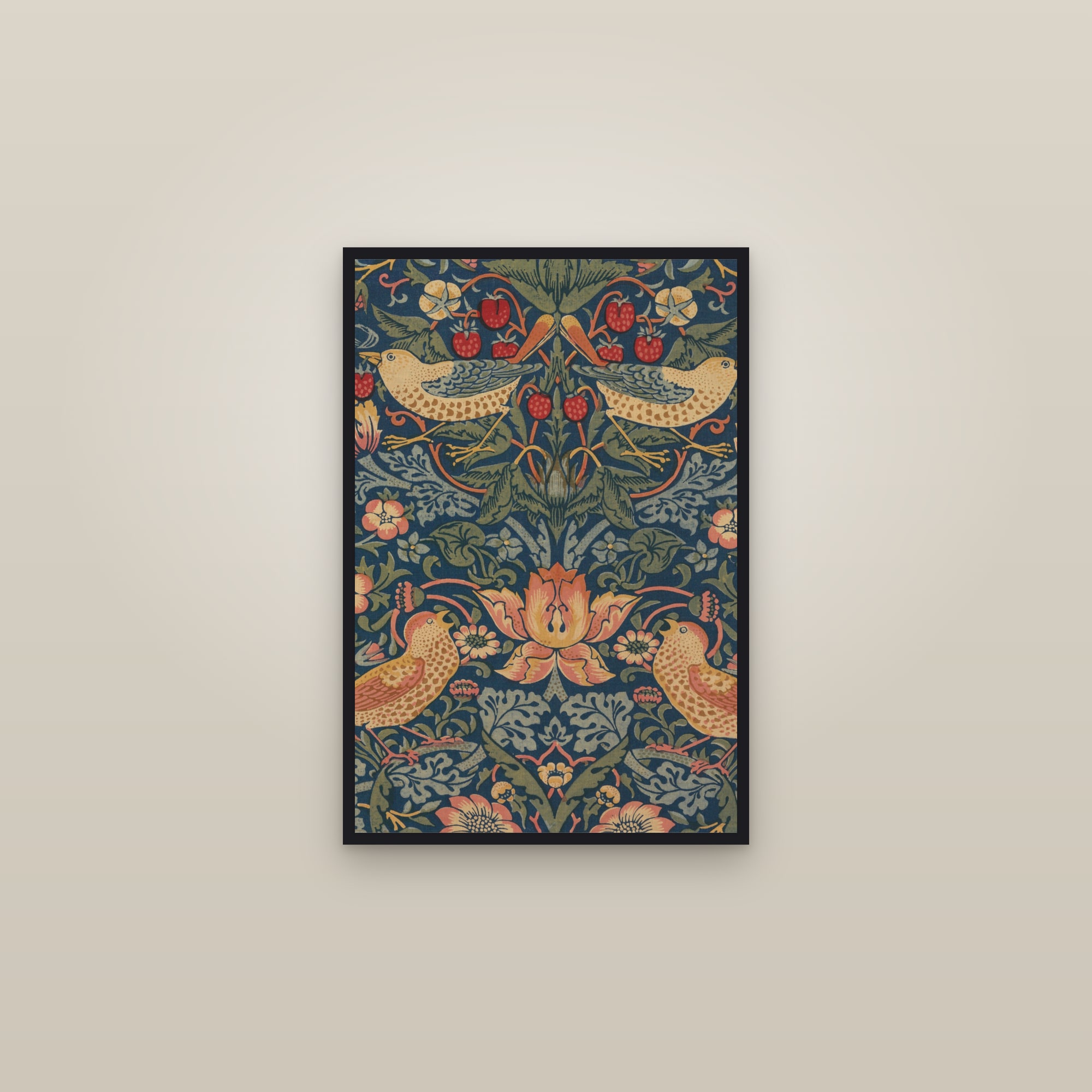
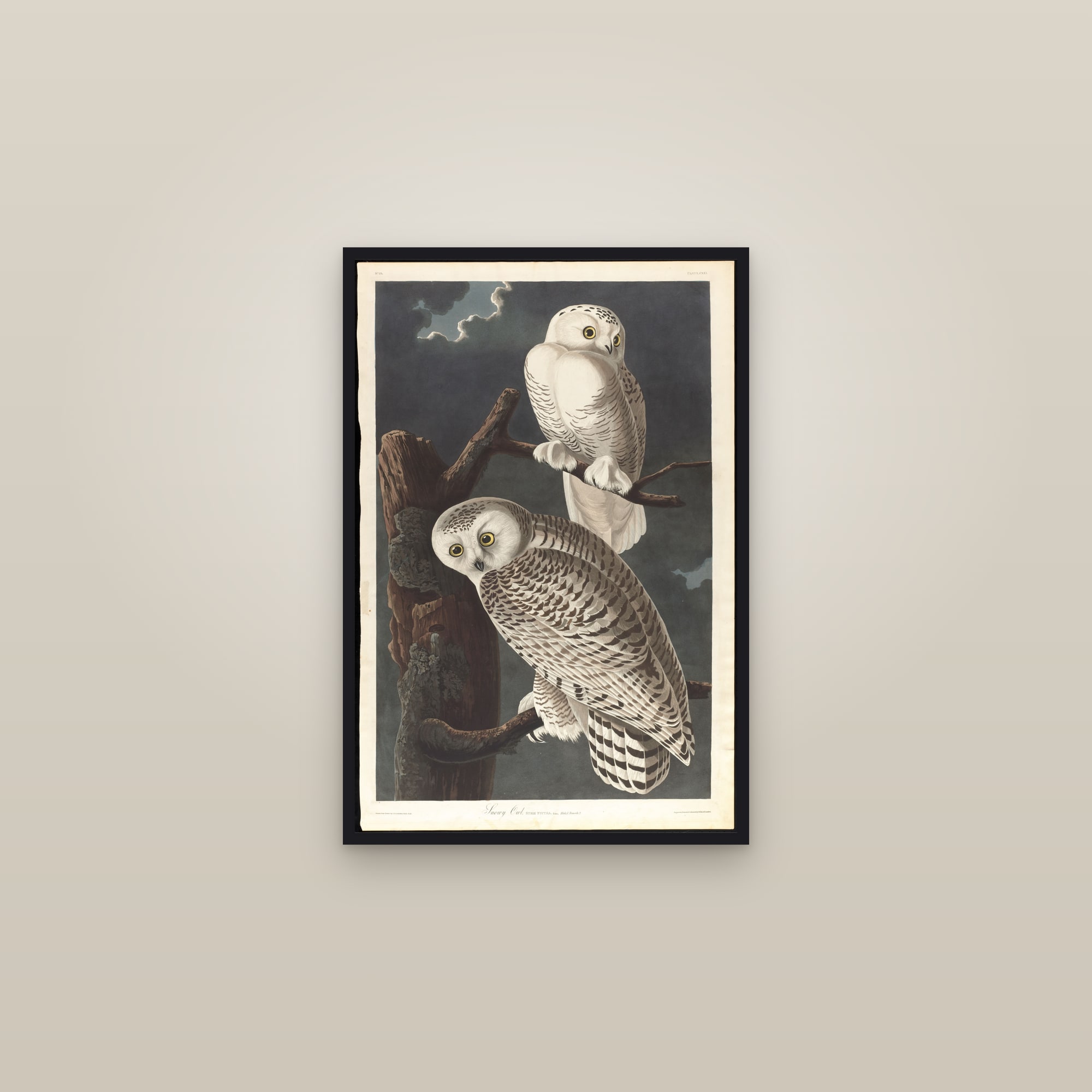
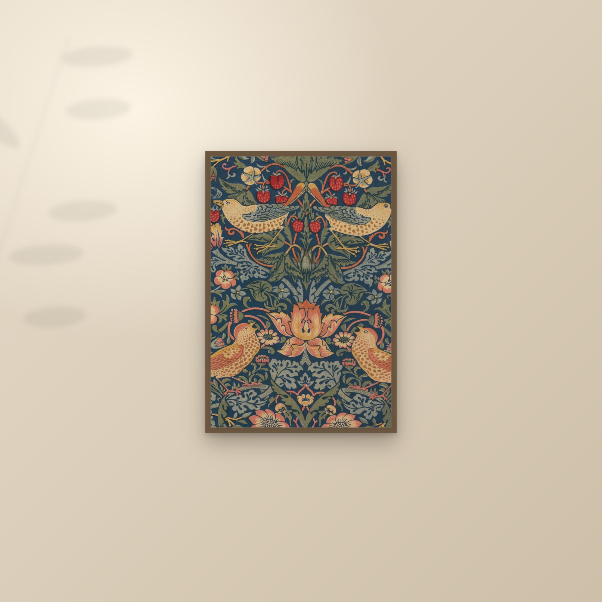
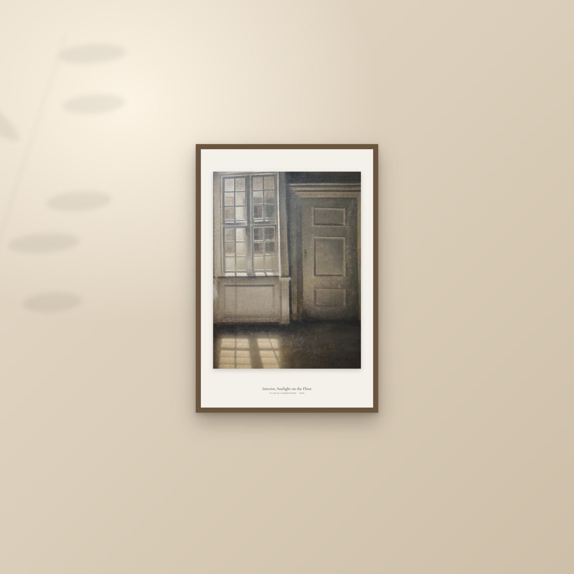
The second move is contrast. A pale room takes a dark picture better than a pale one: a snowy owl on a night sky, a Hammershøi interior in greys, the deep ground of a Morris pattern. A dark room, a green study or a navy dining room, wants a print with light in it, a cream botanical sheet or a Japanese print with an open sky. The colour pages (burgundy, cornflower blue, neutral and beige) are sorted this way, by the wall rather than the subject.
What about light and glass?
Two things to know. Direct sun fades any print over the years, so keep art off the wall that takes full afternoon sun, or accept that it will not look the same in a decade. And glass reflects. A framed print opposite a window shows you the window; a framed print opposite a lamp shows you the lamp. Move the lamp, hang the picture on the window wall rather than opposite it, or choose canvas for that spot.
Artificial light flatters most prints if it comes from above and slightly in front, which is what a picture light or an angled ceiling spot does. Overhead light straight down the wall makes the frame cast a shadow across the top of the image and leaves the bottom dull.
Which art suits which room?
Living room. The sofa wall gets the biggest, calmest piece in the house: a wide landscape, a painting with one subject, or three matched prints at the width the table gives. Nothing small. Nothing busy enough to compete with the television. If the room has a second wall that is seen from the sofa, that is where a smaller, more detailed piece can go, since it is looked at rather than past. Start at living room wall art.
Bedroom. Above the bed, a horizontal piece or a pair, hung low (the gap rule, not the 57-inch rule, since you see it from the doorway and from the bed). Quiet subjects: water, snow, mist, blossom, a single bird. Not a face; portraits watch you sleep. Keep the palette within two or three tones of the bedding, and give the wall opposite the bed, the one you see first in the morning, the better picture. See bedroom wall art.
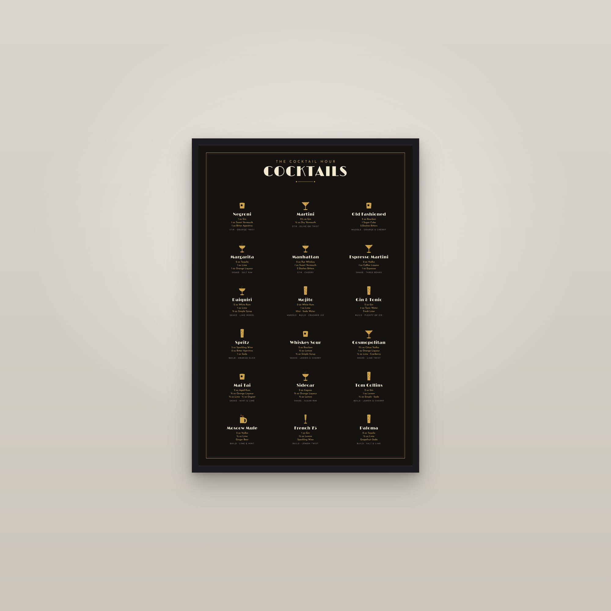
Dining room. Seen sitting, by candlelight or a pendant, for hours at a time. Hang a touch lower than usual, and choose something with enough in it to look at over a long dinner: a Dutch still life, a map, a crowded Japanese street scene, a cocktail chart if the room doubles as the bar. Dining room wall art has the longer list.
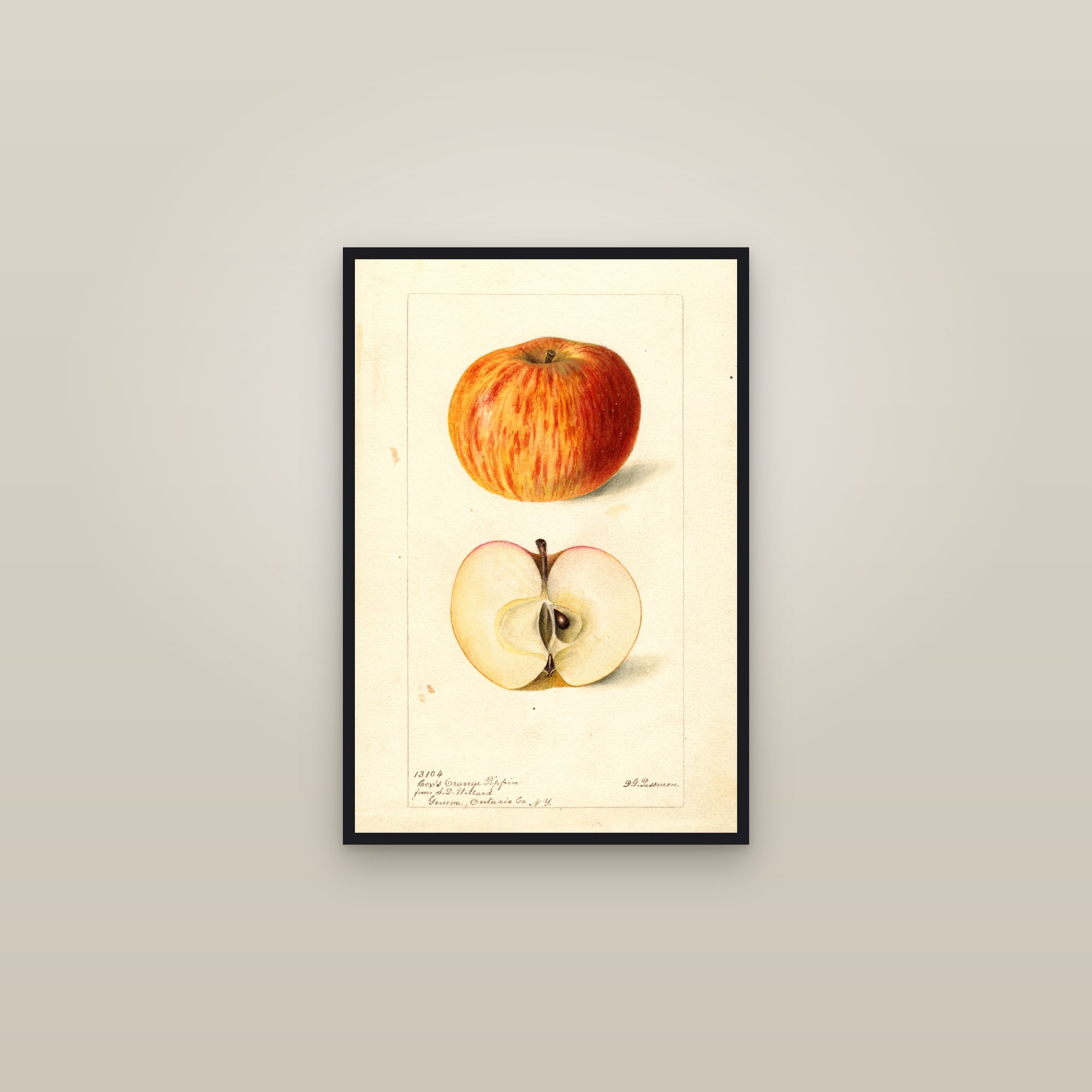
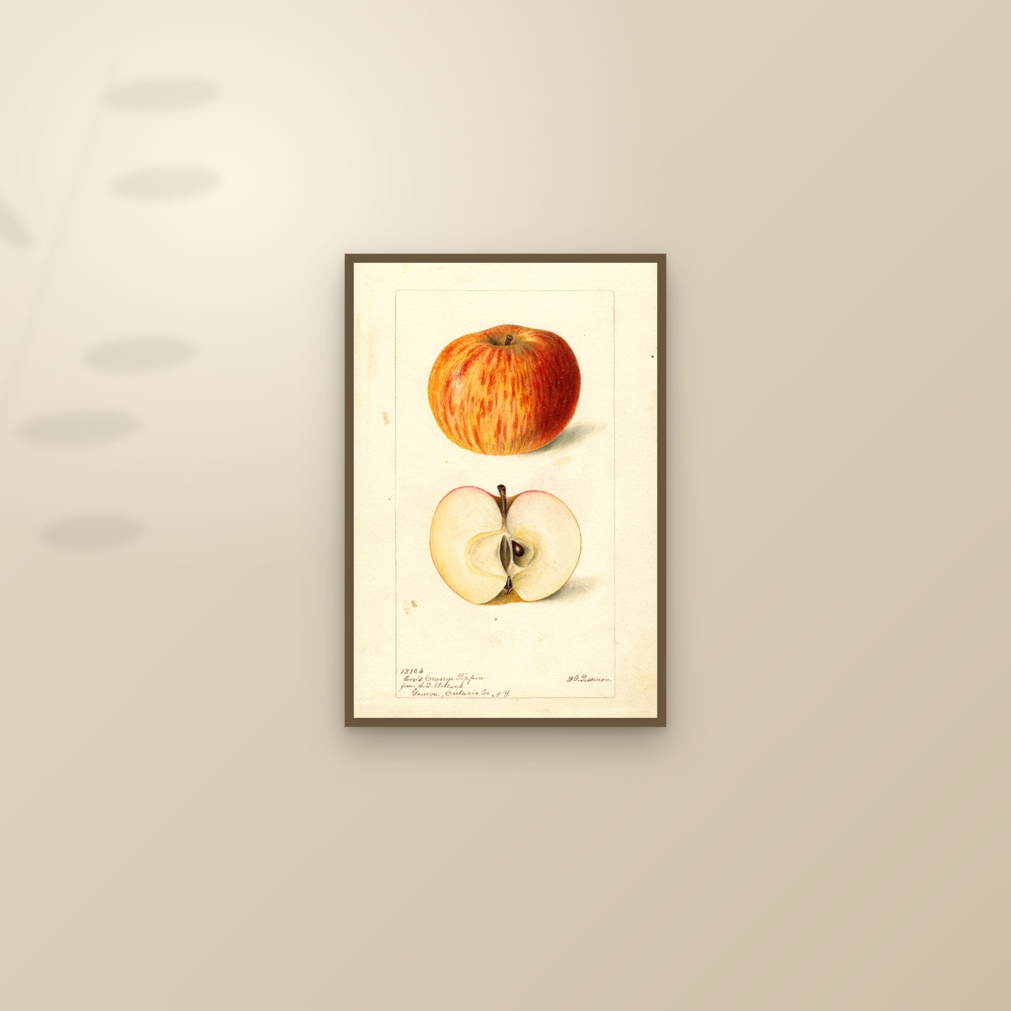
Kitchen. Steam and grease are the enemies, so frame everything and keep it away from the hob. Fruit and botanical plates were made for this room: a single apple, a pear, a sprig of rosemary, on a cream sheet, in a dark wood frame. Three in a row above the counter is the classic. See kitchen wall art.
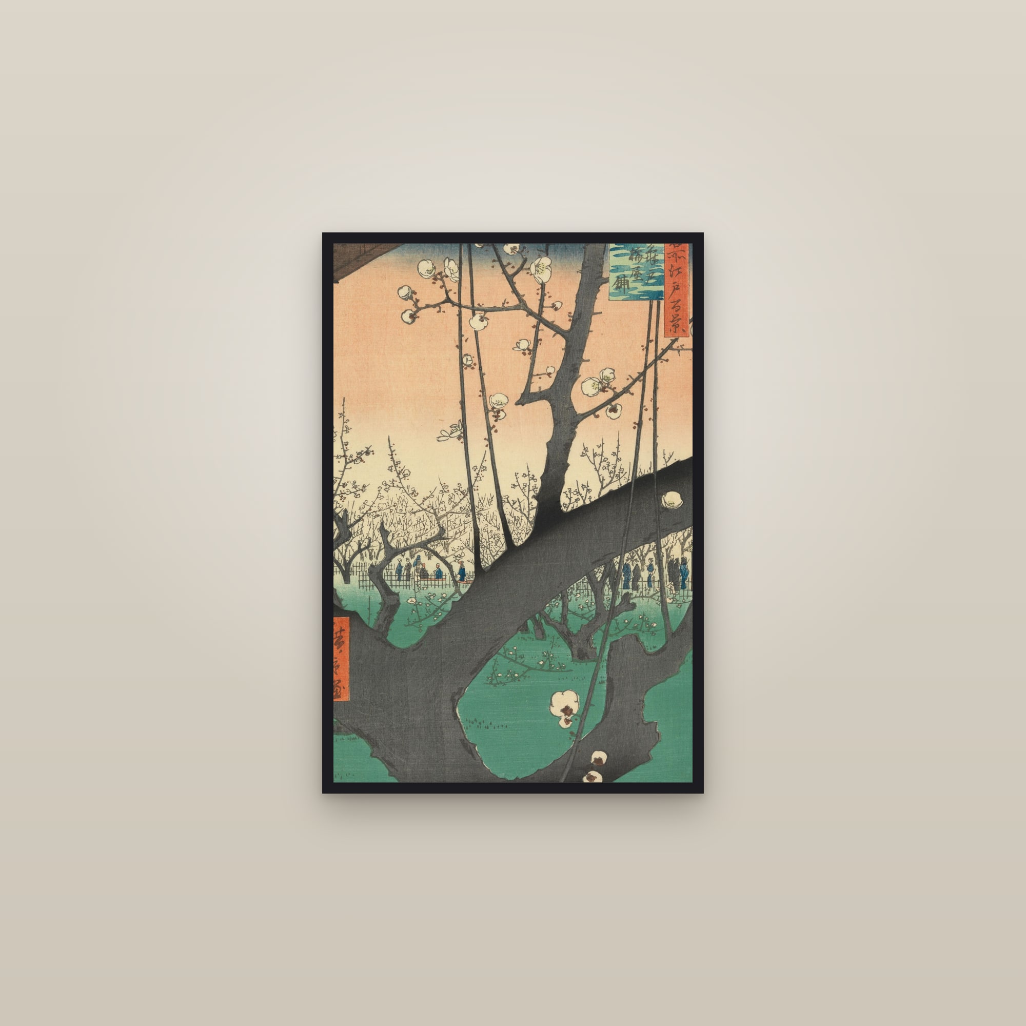
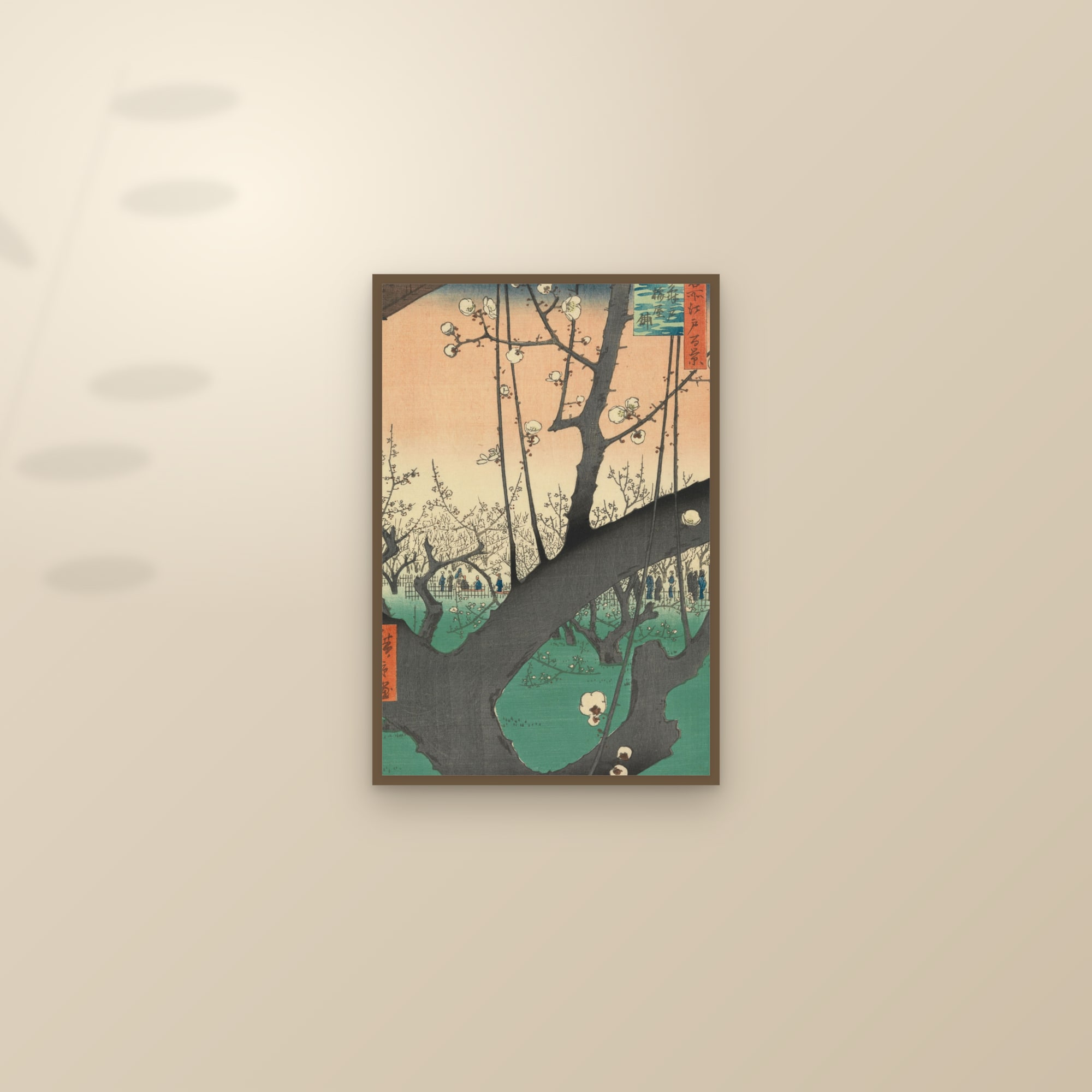
Hallway and entry. Passed at walking pace, so a row beats a single piece: three or five prints at the same height, same frame, same gaps, with the centre line at 57 inches. Portrait formats suit narrow halls. A tall woodblock, a blossom branch, a column of birds. See hallway and entryway wall art.
Office. You look at this wall between tasks, and it appears behind you on video calls. Choose something still and structured: an architectural interior, a single landscape, an engraving, a map. Avoid anything with a face at eye level behind your head on camera. See office wall art.
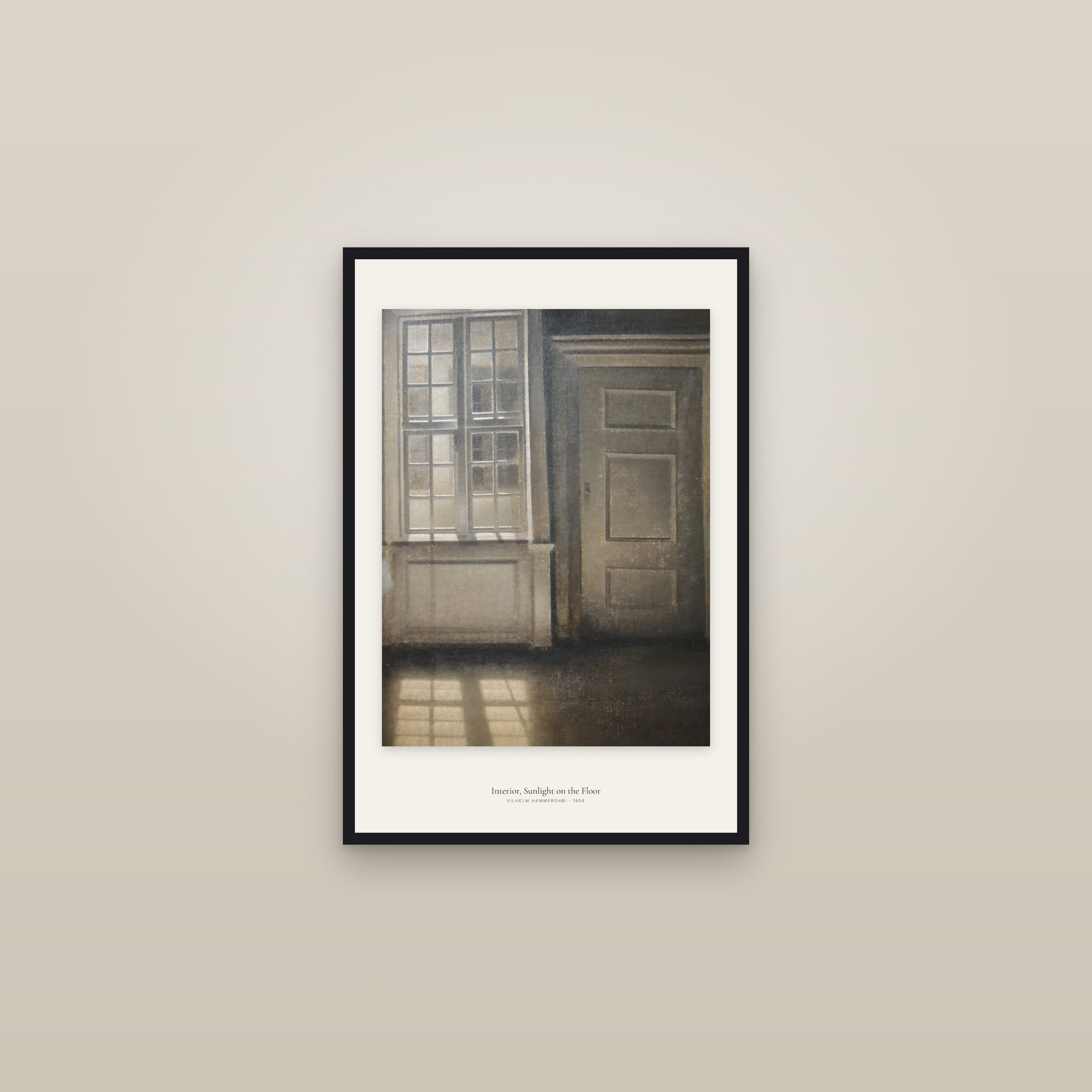
Bathroom. Humidity rules out unframed paper and anything precious. A framed print on a wall away from the shower is fine; a small botanical, a fern, a sea creature. See bathroom wall art.
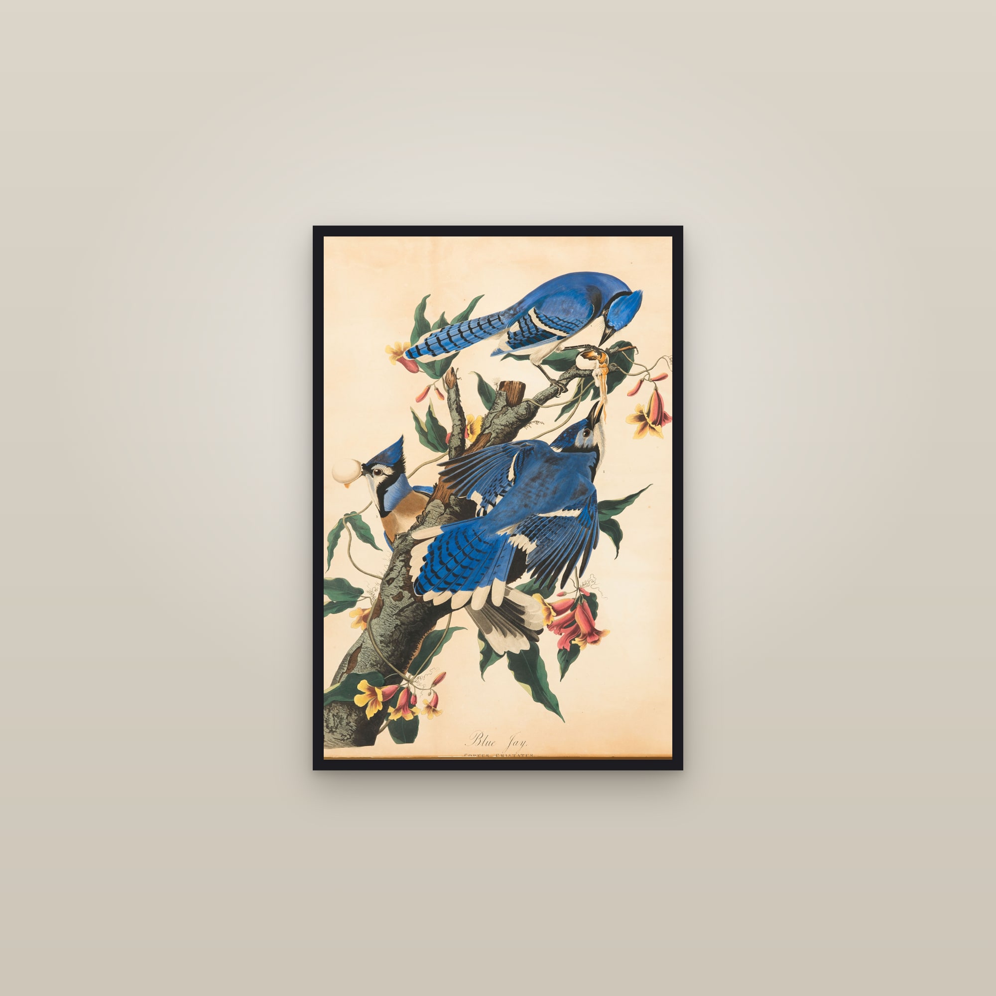
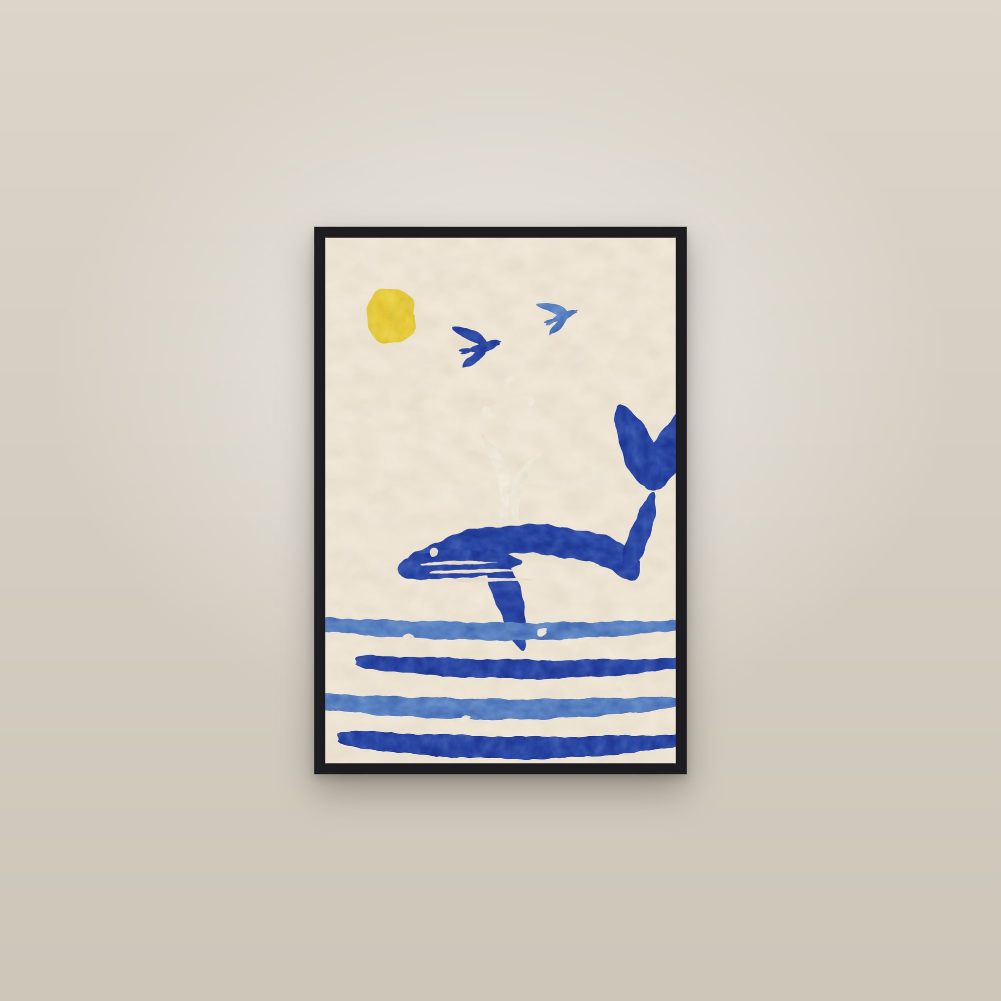
Kids' rooms. Colour, animals, clear shapes, and nothing that needs explaining. Audubon's blue jays, a paper cut-out whale, a row of fruit. Never a nude and never a violent scene, which rules out a surprising share of the classical canon, and all of the anatomical figure plates, however educational they look. Our kids' room wall art page is filtered this way.
What does each style actually ask for?
One line each, because that is all the term means on a wall.
- Japandi: one Japanese print or one pale botanical, a thin dark wood frame, a lot of empty wall around it. The restraint is the style; a second picture on the same wall breaks it. See Japanese and zen prints.
- Maximalist: more pictures than seems sensible, hung close, dark frames, pattern on pattern. Morris and the bold abstracts belong here, and the rule about one shared colour relaxes to two or three.
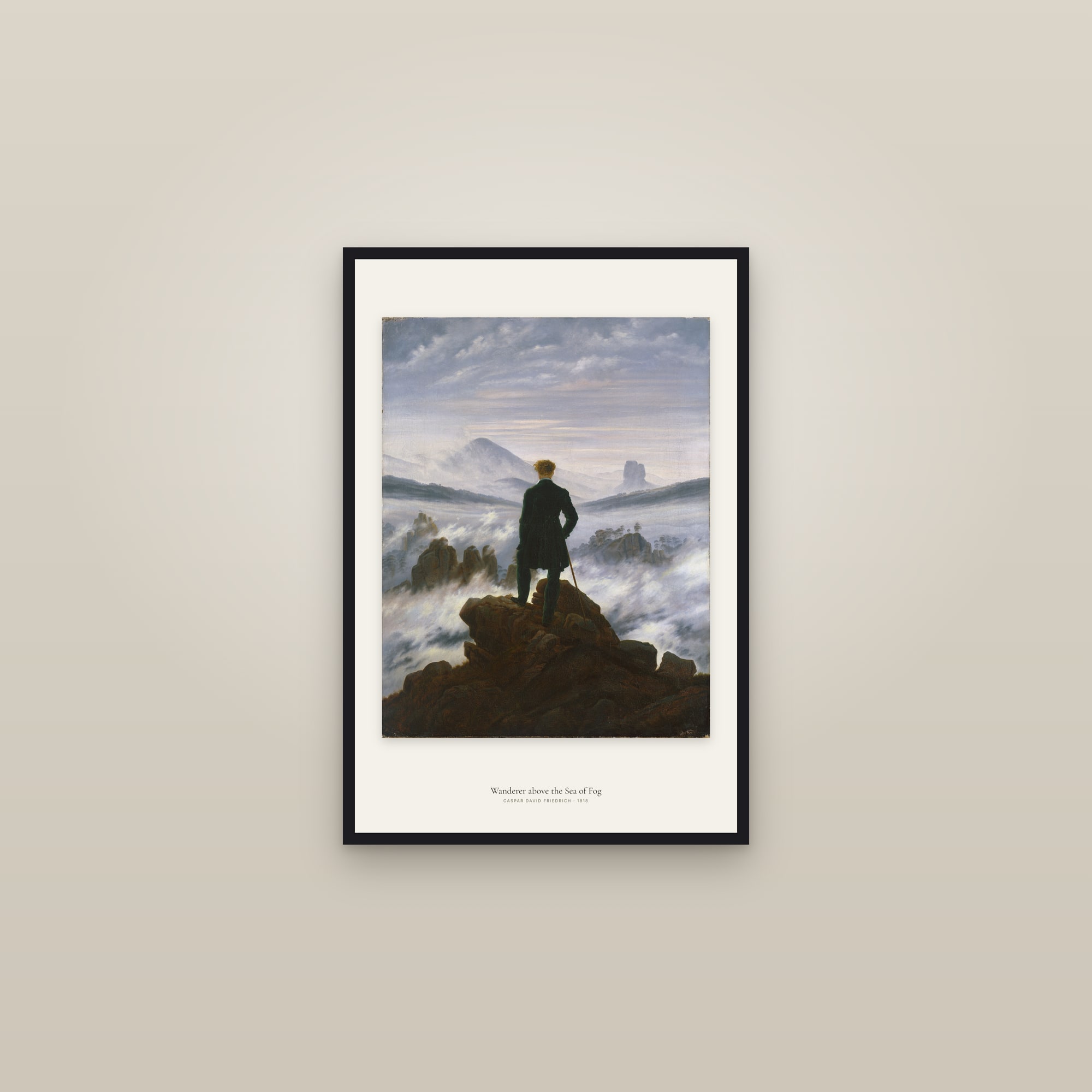
- Dark academia: engravings, anatomy, old maps, a Friedrich, in black frames on a dark wall. Cream paper against a deep green or near-black wall is the whole effect; the pictures can be small if there are enough of them.
- Cottagecore: fruit and flower plates in dark wood, hung in pairs and threes, a little lower than the rule. Specimen editions with their printed captions suit it; the caption reads as a label from an old herbarium.
- Mid-century: one large abstract or one large landscape, slim black frame, nothing else on the wall. Scale does the work, so buy the top of the size ladder.
- Coastal: sea, sky and the pale end of the palette; a Japanese wave, a Turner, a cut-out whale. Keep frames light in weight if not in colour, and leave the wall mostly empty.
What are the five mistakes?
- Too small. The commonest fault by a distance. If you are choosing between two sizes, buy the larger one.
- Too high. The centre at 57 inches, the bottom of the frame 6 to 10 inches above the furniture. Not higher.
- Matching everything. One shared colour. Not the whole palette.
- Mixed frames in one group. Three prints in three frames are three pictures. Three in one frame are one object.
- Buying the picture before measuring the wall. The wall sets the size; the size narrows the choice; the choice is then easy.
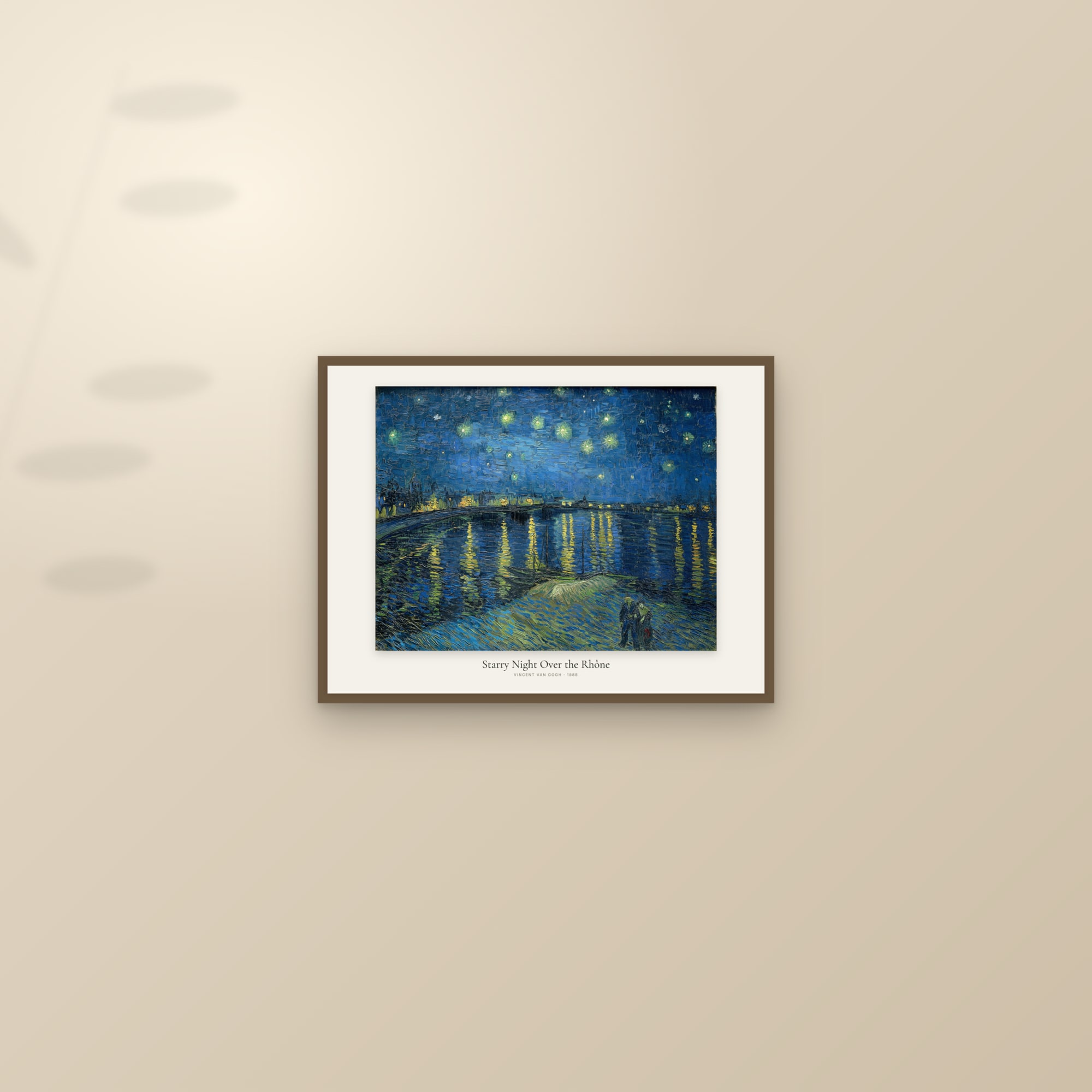
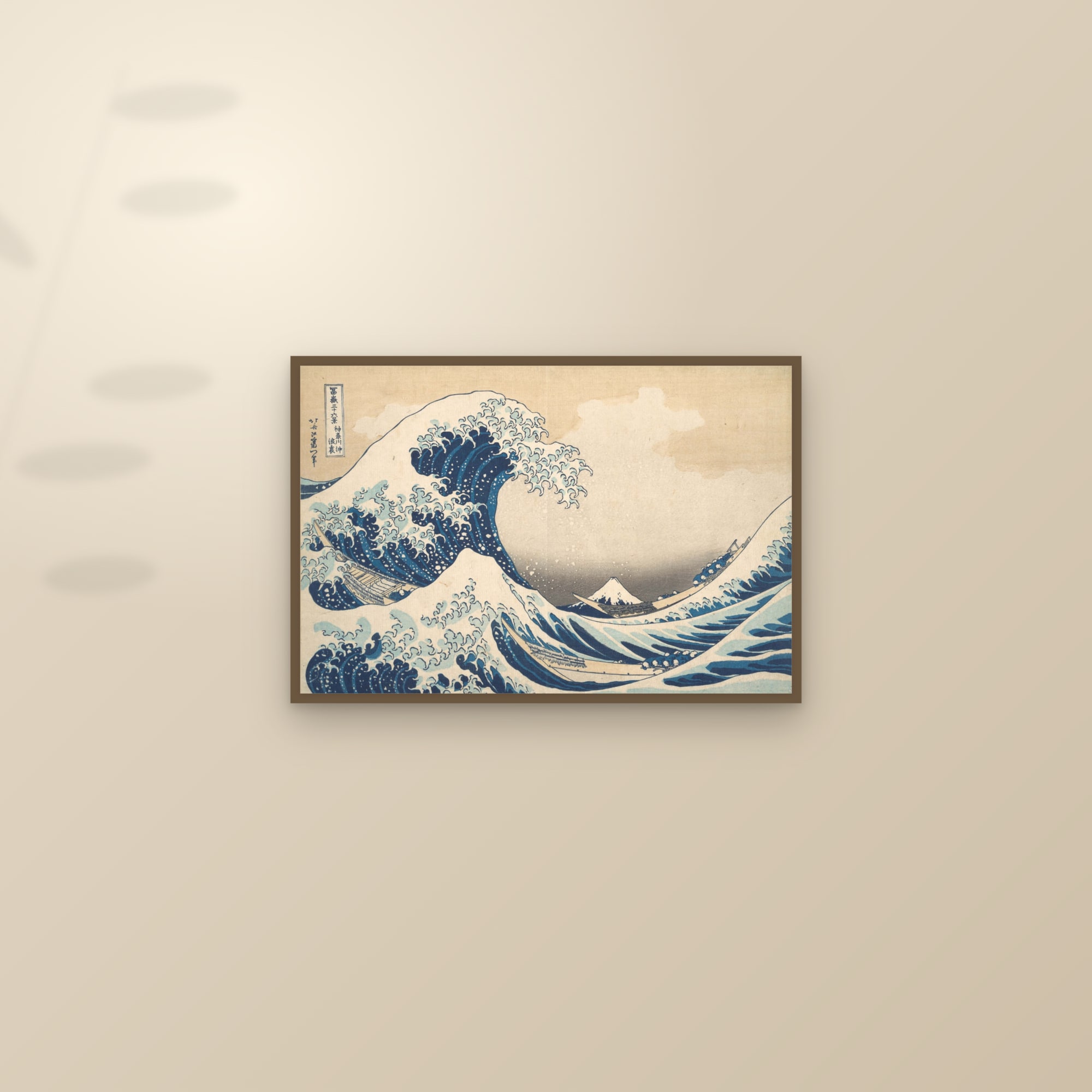
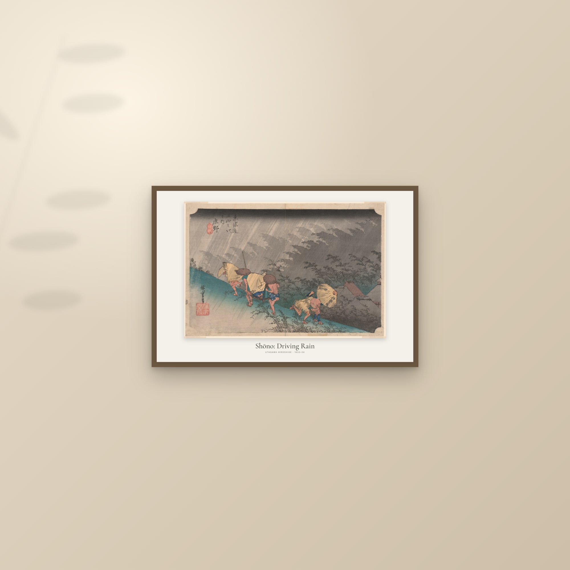
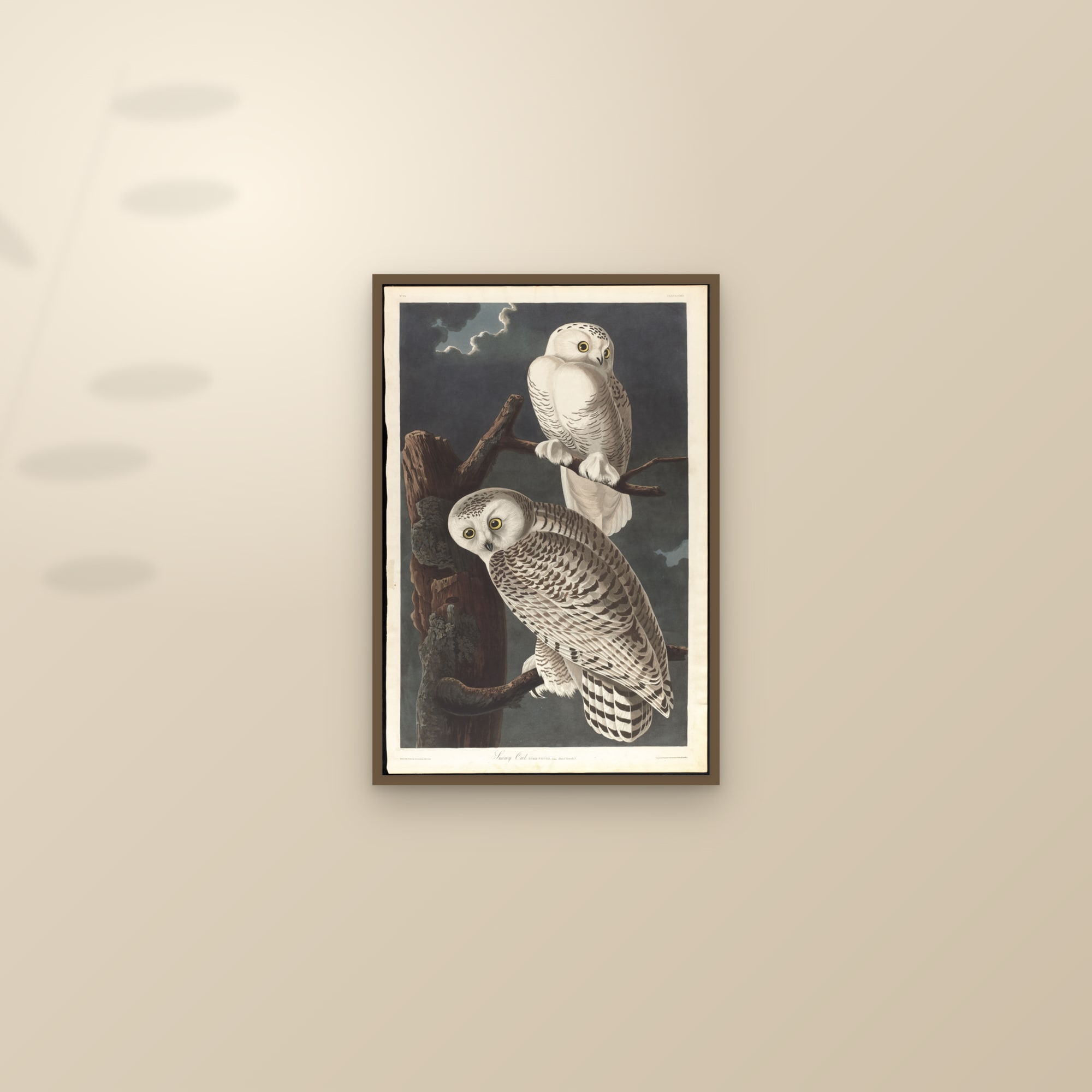
Where to go next: the sofa sizing table, gallery wall layouts, and framed, unframed or canvas. For a particular wall colour, the living room and large and oversized pages are the two most people need.
Questions people ask
How big should wall art be?
Wide enough to hold the wall it is on. Above furniture, aim for 60 to 75 percent of the furniture's width; on an empty wall, two-thirds of the wall's width is a safe target for a single piece or a group.
How high should I hang a picture?
Hang it so the centre of the image sits about 57 inches (145 cm) from the floor, the convention galleries use for standing eye level. Above a sofa or sideboard, let the furniture set the height instead: 6 to 10 inches of wall between the furniture and the bottom of the frame.
Is one large piece better than a set of three?
One large piece is calmer and suits a wall with one job, such as above a sofa. Three smaller prints suit a long wall, a hallway or a room that needs rhythm, and they let you reach a width no single print can.
Should I buy framed prints or canvas?
Framed paper suits detailed work such as botanical plates, engravings and anything with a margin. Canvas suits paintings that fill their edges, and large walls where glass would reflect the room.
How do I choose art colours for a room?
Take one colour that already exists in the room, a cushion, a rug, the wood of the floor, and find it somewhere in the print. One shared colour is enough. Matching everything looks like a showroom.
What art is safe for a child's room?
Birds, fruit, sea creatures, simple cut-outs and landscapes. Nothing with nudity or violence, which rules out many classical paintings and the anatomical figure plates.
Sources
- Park West Gallery, Three Simple Rules for Hanging Art (57-inch centre; 6 to 8 inches above furniture)
- Fine Art America, How High to Hang Art Above a Sofa (two-thirds width; 6 to 10 inches of wall; 57 to 60 inches centre)
- The Trout Gallery, Dickinson College, How to Hang a Frame Perfectly (eye height taken as about 60 inches to the middle of the image)
- Chairish, How High to Hang Artwork: a Designer's Guide with Measurements (57 to 60 inches; 6 to 12 inches above furniture)
- PictureFrames.com, How to Group Pictures on a Wall (2 to 3 inches between frames)
- Simply Framed, How to Hang a Picture: Rule #1 (57 inches as the average sight line; cites Sacher and LaGasa's hanging principles)