
What is a chromolithograph, and how do you spot one?
A colour print made to look like a painting, at a much lower cost. Why people wanted them, how one stone per colour worked, and which plates and posters we print really are chromolithographs.
Contents7 sections
A chromolithograph is a colour print made to look like a painting, at a much lower cost. Technically it's a print made by lithography, with a separate stone for each colour, printed one over another in exact alignment so that the layers add up to something like a brushed picture. The American Antiquarian Society gives the range as eight to forty stones.
People wanted them because they brought paintings within reach. Louis Prang, the Boston publisher who coined the word chromo, came to believe that art could and should be democratized, and he began reproducing oil paintings this way in 1866. Michael Clapper's history of the Prang company reports that between 1866 and 1876 Prang and other publishers sold hundreds of thousands of chromos across the United States, and that Prang's own audience was mostly middle class. Public demand was tremendous, even while many commentators doubted a chromo was art at all. Catharine Beecher and Harriet Beecher Stowe wrote in 1869 that the educating influence of these works could hardly be over-estimated. A major effect, Clapper says, was to bring art into the daily experience of a broad public.
Until photomechanical printing took over in the 1890s, chromolithography was the main way of making colour images in quantity. The word is also used loosely. Many prints called chromolithographs, including the famous posters, are more exactly colour lithographs, and some colour plates in old books are neither.

How does a stone print without being cut?
Lithography is flat. The carver's relief and the engraver's groove are both gone, and the image sits at the same level as the blank stone. It depends on the fact that oily ink and water do not mix. The Metropolitan Museum of Art sets out the steps:
- The design is drawn on polished limestone with an oil-based crayon or ink.
- A solution of gum arabic, usually with a mild acid, is brushed over it. This fixes the greasy image and makes the blank stone take water and refuse ink.
- The stone is dampened. Water stays only on the blank areas.
- Ink is rolled on. It clings to the greasy image and is repelled everywhere else.
- A damp sheet goes through a flatbed press under a pressure bar, and the image transfers in reverse.
The Antiquarian Society dates the invention to Germany in 1796; our short history follows the account that gives 1798 for Alois Senefelder's process. Prang explained the chemistry in a speech reported by the New York Tribune and quoted by the Society: a crayon of soap, wax and lampblack, and an acidulated gum that binds its fat to the stone.
How do you get colour from it?
You repeat the process, once per colour, on the same sheet. Prang's speech explains how a commercial chromo was built:
- A painting comes first. The colours of the original are analysed into a scale of inks.
- A tracing fixes the drawing. A sheet of transparent gelatin goes over the painting, and the outlines and colour areas are drawn on it.
- A key stone is made. The tracing is transferred to a stone. Impressions from it, dusted with red chalk, are then transferred to as many fresh stones as the picture needs, so that every stone starts from the same drawing.
- Each colour is drawn by hand. An artist draws a separate stone for each ink. Yale's The Printed Picture stresses that these separations had nothing to do with the scientific ones of later process printing. They were judgements.
- The sheet goes through the press, again and again. By Prang's account the outline stone itself is not used in the final image.
Yale's example, an 1877 reproduction of a van Eyck panel, used at least eight stones and perhaps many more; intermediate tones came from stipple, tiny hand-drawn dots, finer in the heads than in the rest of the picture. The Antiquarian Society's progressive proofs for Prang's The Prize Babies show nineteen stones.
Registration
Registration means every stone meeting the same sheet in the same place. Without it, the picture blurs. The Antiquarian Society records Prang's solution: small crosses on each side of the sheet, marked by the chromist, the artist drawing the stones, so that the colours would not drift. Yale identifies crosses in the margin as the oldest method of aligning multiple impressions. Look for them in the margins of proofs.
Why did it make colour cheap?
Because colour stopped being a wage bill for each copy. In a hand-coloured book, every sheet went through a colourist's hands: Audubon's Birds of America used as many as 150 of them. A chromolithograph concentrated the skill at the start, in the drawing of the stones, and the press then repeated it.
The stone also lasted. The Antiquarian Society notes that lithography could yield many more impressions than copper or steel, whose lines flatten under pressure (see how copper engraving worked). When a job was over, the stone was ground down and regrained for the next picture, and from the early 1870s Prang's company used thin zinc plates in place of more expensive limestone.
The fine-art chromos drew the most press comment, but they were not the main business. Most of what such firms printed was labels, posters, business cards and advertising. Clapper dates the end of the era to the perfection of photomechanical printing in the 1890s.
Chromolithograph or colour lithograph?
These are not quite the same thing, and the difference matters for what we print. The Antiquarian Society draws the line this way: a colour lithograph starts from a black outline drawing filled in with colours from other stones, while a true chromolithograph uses many stones to look like a painting. Prang himself defined a chromo as "an imitation of an oil painting" and complained, Clapper records, that competitors were calling every coloured lithograph by the name.
So treat chromolithograph as a term for a kind of ambition, not a separate process: many stones, and an imitation of a painted surface.
Which of our works are chromolithographs?
Going by the sources, fewer than the word's popularity suggests.
| Works | What the original is | A chromolithograph? | Source |
|---|---|---|---|
| Köhler's Medizinal-Pflanzen | Book plates in colour | Yes | University of Iowa |
| Haeckel, Kunstformen der Natur | Lithographs in colours, most in one colour | Not strictly; some use three or four colours | Wellcome |
| Chéret posters | Colour lithographs | Only in the loose sense | Milwaukee Art Museum curator |
| Mucha posters and panels | Colour lithographs, some with metallic ink | Only in the loose sense | V&A |
| Audubon's Birds of America | Copper plates coloured by hand | No | Our Audubon piece |
| Sobotta, 1919 volume | Multicolour halftones | No, though the first edition was lithographed | Sobotta's prefaces |
| USDA Pomological Watercolors | Original watercolours | No | National Agricultural Library |
Köhler: the real thing
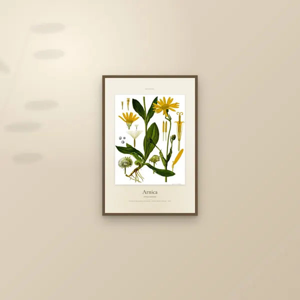
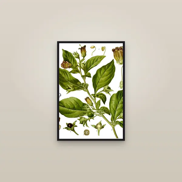
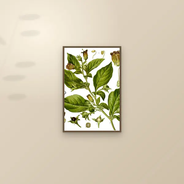
The University of Iowa's record of Köhler's Medizinal-Pflanzen, published at Gera, describes some 300 full-page chromolithography plates by Walther Müller, C. F. Schmidt and K. Gunther. They show what the process was good at: strong, solid colour repeated across hundreds of plates in a working book of drug plants. Belladonna and Arnica come from this book.
Haeckel: lithographs in colours, mostly one
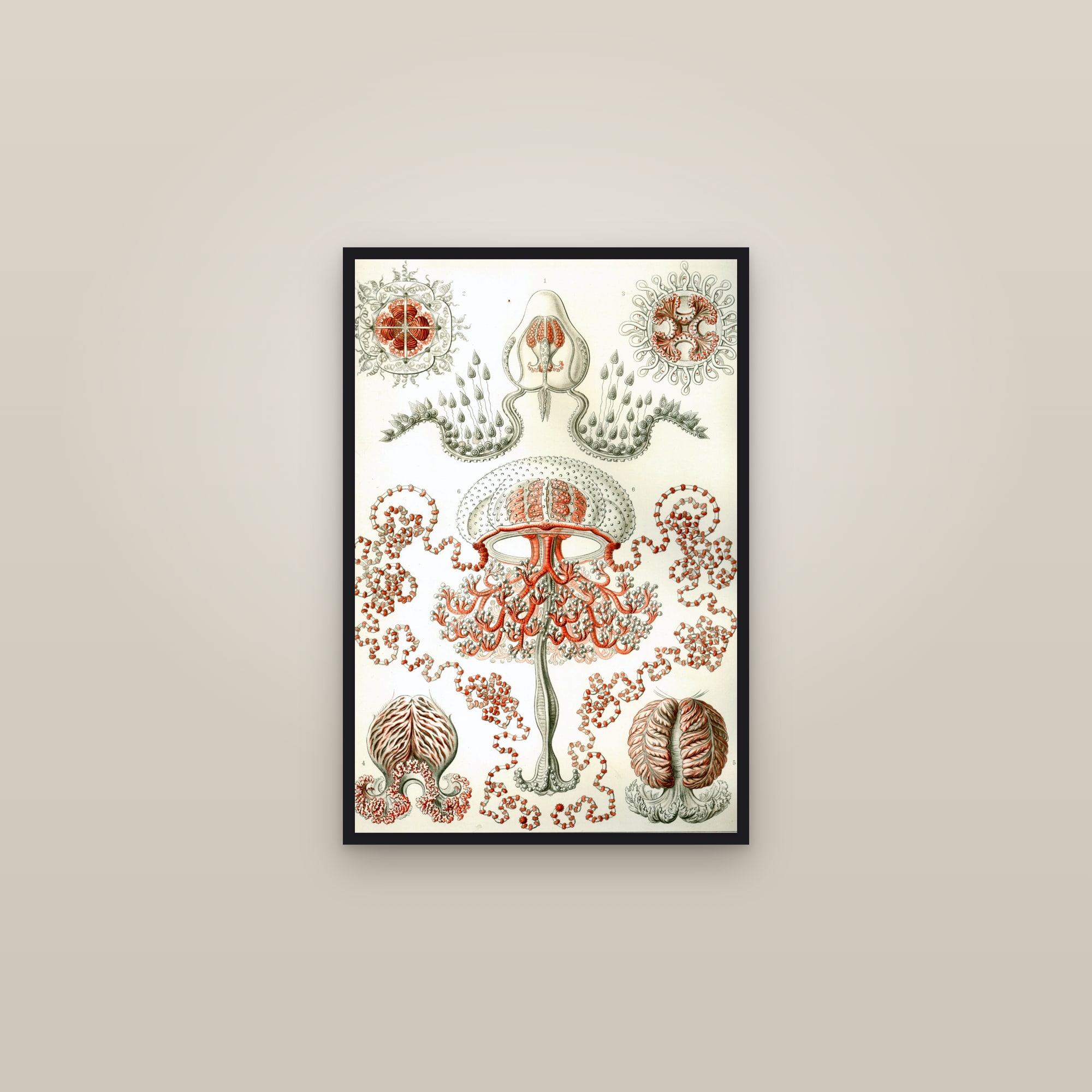
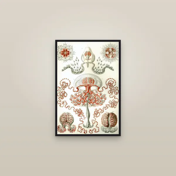
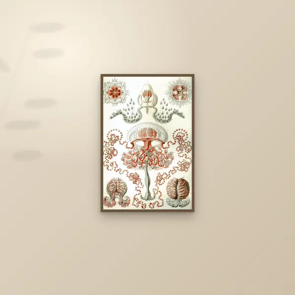
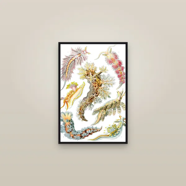
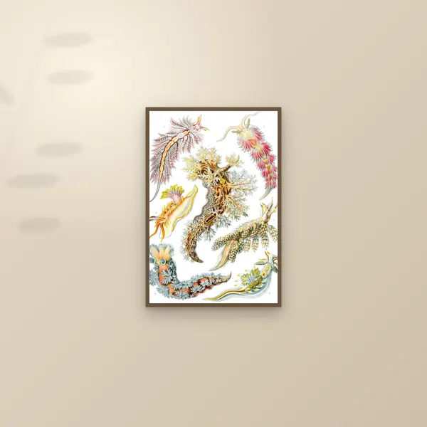
Wellcome Collection's record of Kunstformen der Natur describes colour lithographs by Adolf Giltsch of Jena, who redrew Haeckel's images on the stone. Most of the hundred plates, Wellcome says, use a single colour, and some use three or four, the birds of plate 99 among them. That's a long way from Prang's nineteen stones. Compare the Anthomedusae, which reads as black and grey with one coral red, and the sea slugs, which plainly use more. We have not found a plate-by-plate account of the printing, so we do not call individual plates chromolithographs.
Chéret and Mucha: posters drawn for the stone
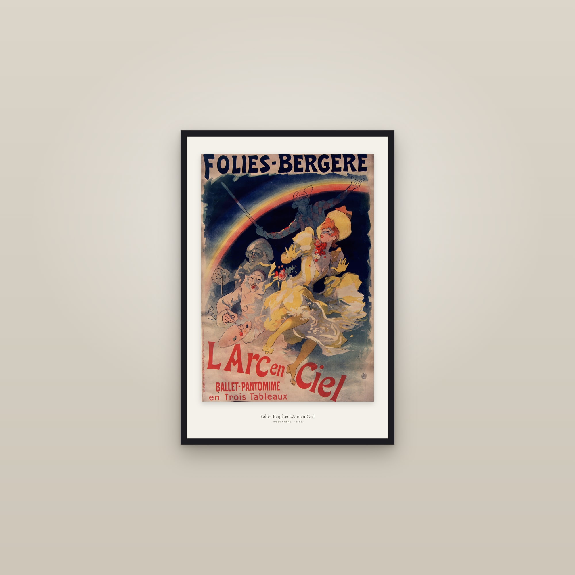
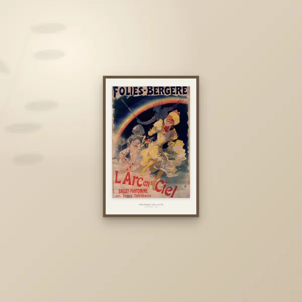
Jules Chéret's achievement was to make big colour posters from very few stones. The Milwaukee Art Museum's curator Nikki Otten describes his method as three: one red, one black and one shaded from orange-red to blue-green. By 1877 he was running steam-powered presses. His L'Arc-en-Ciel of 1893, a colour lithograph at the V&A, was printed by Chaix, whose mark runs up the lower left edge. We have found no record of how many stones this particular sheet took, so we do not put a number on it.
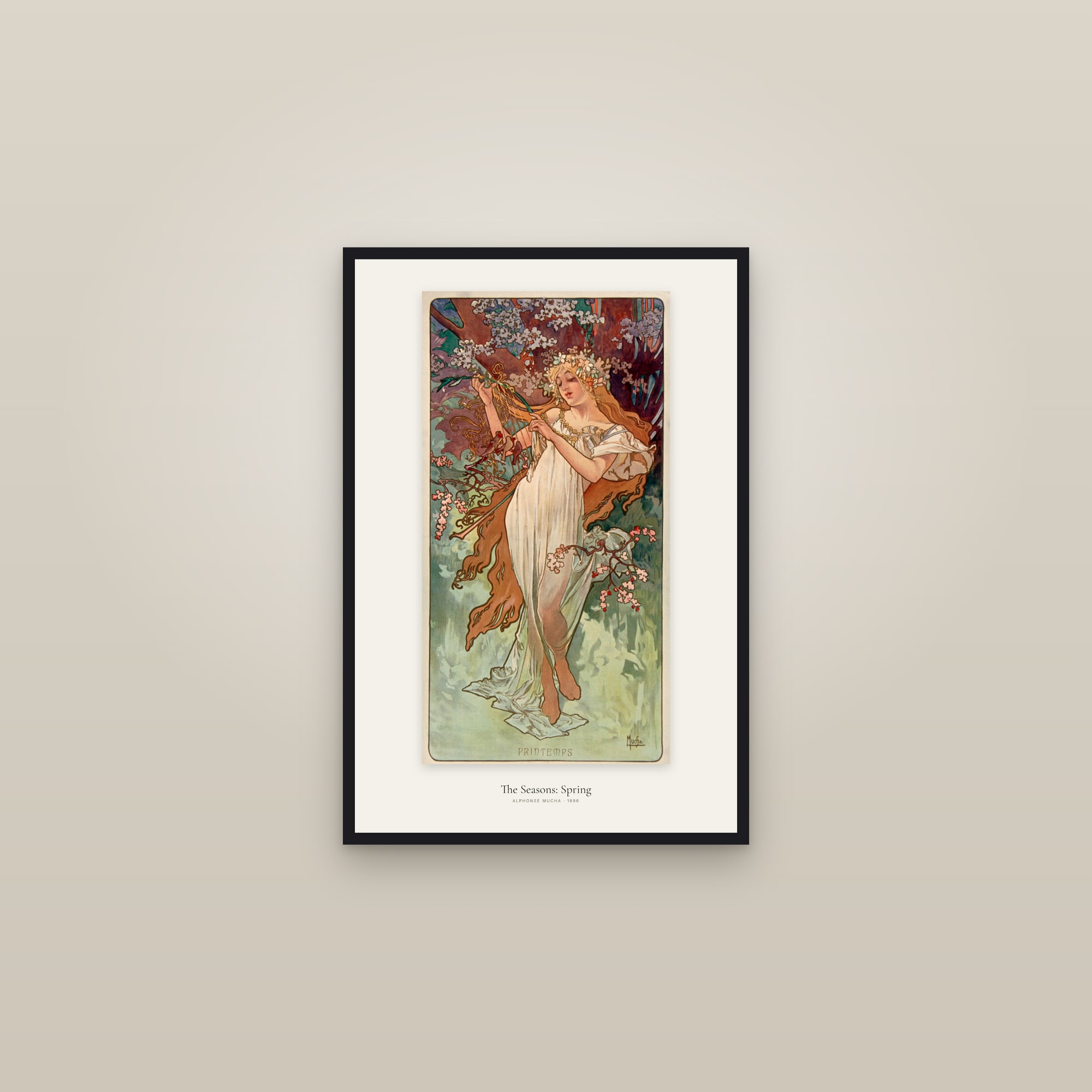
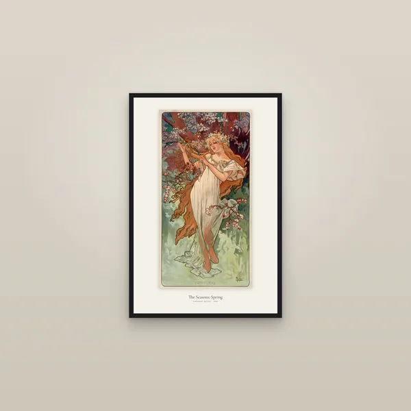
Alphonse Mucha's work reads as far more painted, but the catalogues say the same. The V&A describes his La Dame aux Camélias as a colour lithograph printed by Imprimerie F. Champenois, with some metallic inks. Clapper counts posters among the output of the chromolithographic firms. But a Belle Époque poster was designed for the stone and imitated nothing, which puts it outside Prang's strict definition. "Colour lithograph" is the exact description, and it's the one to look for on a museum's label.
Sobotta: lithographed once, and then not
The Sobotta atlas shows the switch inside one book, and it's the case where the label needs the most care. In the preface to his first edition, Johannes Sobotta says he used multicolour lithography, "to my knowledge for the first time for the purpose of anatomical illustration", for thirty of the first volume's thirty-four colour plates. The plates we print do not come from that edition. Our muscle plates come from the 1919 volume, and by then the stones had gone. The second-edition preface says the lithographic muscle plates were dropped altogether for multicolour halftones (pictures broken into dots by a camera screen), partly for consistency and partly because many colleagues disliked their colours as too lively and garish on white paper. The 1919 preface reports no notable changes, blaming the war.

The USDA fruit: paintings, not prints
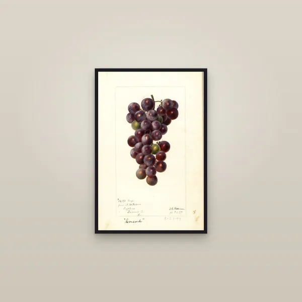
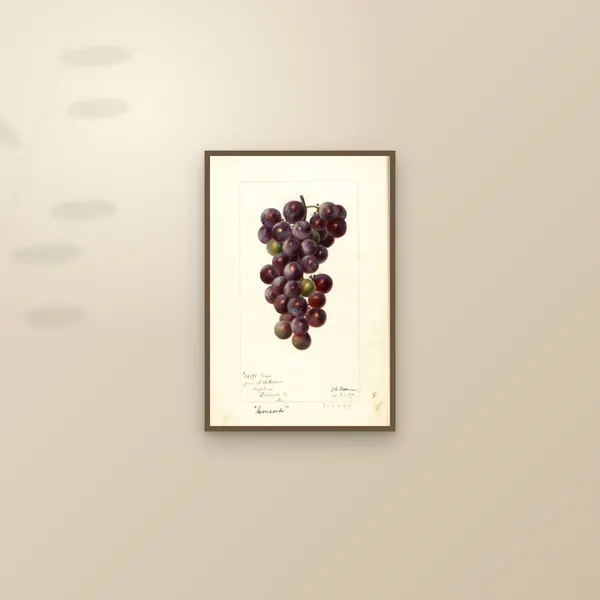
The USDA Pomological Watercolor Collection at the National Agricultural Library holds original paintings. Its finding aid does confirm a printed side to the story: from 1887 the Division of Pomology hired artists to illustrate fruit varieties for lithographic reproduction in USDA articles, reports and bulletins. Those printed versions are not what we print. The Concord Grape by Deborah Griscom Passmore is a scan of the 1897 painting, with the handwritten notes still on the sheet.
How do you spot one?
These tests need the old sheet and a magnifying glass. None of them work on a reproduction, including ours, which are printed to order from restored scans.
No plate mark. A lithograph is printed from a flat stone under a pressure bar, so it has none of the rectangular dent that a copper plate forces into the paper.
Irregular marks. Under a glass, chromolithographic tone is drawn by hand, and it can change in fineness across the picture, as in Yale's van Eyck. A halftone is made through a screen, and its dots sit in a regular pattern. A neat grid means the picture is photomechanical and probably later.
Colour in layers, or colour on top. Printed colour sits in shapes that repeat from copy to copy. Hand colour differs slightly on every sheet. If you can see brushwork over a printed image, it's a hand-coloured print.
Labels. Trust a catalogue that says "colour lithograph" over a seller who says "chromo". Prang was already complaining about that word within a few years of coining it.
Where it sits in the story
Chromolithography is one chapter of a short history of the print. The Japanese woodblock had reached full colour by 1765, block by block and by hand. Copper engraving gave Europe its precise line, and often left colour to the brush. The stone brought colour to the press in quantity, until the camera took the job over.





Questions people ask
What is a chromolithograph?
A colour print made by lithography, with a separate stone for each colour, printed one over another on the same sheet. The American Antiquarian Society gives eight to forty stones as the range. The aim was to reproduce a painting, and the shortened word 'chromo' was coined by the Boston publisher Louis Prang in 1865.
What is the difference between a chromolithograph and a colour lithograph?
A colour lithograph is any lithograph printed in colour. A chromolithograph, strictly, is a colour lithograph that builds up a painted effect from many stones, while a simpler colour lithograph fills a black drawing with colours from a few others. The words overlap in practice: Prang himself complained that rival publishers called every coloured lithograph a chromo.
Are Belle Époque posters chromolithographs?
The more exact term is colour lithograph, which is how the V&A catalogues Mucha's La Dame aux Camélias. Chéret's method used as few as three stones. Posters came from the same firms as chromos, but they were designed for the stone, not copied from a painting.
Were Haeckel's Kunstformen der Natur plates chromolithographs?
Wellcome Collection catalogues them as lithographs printed in colours, drawn on the stone by Adolf Giltsch. It notes that most are in a single colour and some in three or four, which is far from the many stones of a true chromolithograph.
How can you tell a chromolithograph from a halftone?
Use a magnifying glass. A chromolithograph's tones are built from stipple or crayon marks drawn by hand on the stone, so they are irregular and can change in fineness across the picture. A halftone is made through a screen, so its dots sit in a regular grid.
Are the USDA Pomological Watercolors chromolithographs?
No. They are original watercolour paintings, held by the National Agricultural Library. The USDA hired the artists so that fruit could be reproduced by lithography in its reports and bulletins, but what we print is a scan of the painting, not of a lithograph made from it.
Sources
- American Antiquarian Society, Louis Prang, Innovator, Collaborator, Educator: Chromolithography (colour lithography versus chromolithograph, Prang's account of the process, eight to forty stones, crosses for register)
- Michael Clapper, Proceedings of the American Antiquarian Society: Industry and Education in Prang's Chromolithograph Company (art democratized, the middle-class audience, the Beecher sisters, the word chromo, Prang's definition, hundreds of thousands sold, the 1890s, regraining, zinc)
- The Metropolitan Museum of Art, Materials and Techniques: Lithograph (the process, one stone per colour, register)
- Yale University Art Gallery, The Printed Picture: colour printing (at least eight stones, stippling, the printer as copyist, register crosses)
- University of Iowa, HEIRS record: Köhler's Medizinal-Pflanzen (some 300 chromolithography plates)
- Wellcome Collection: Haeckel, Kunstformen der Natur, colour lithographs by A. Giltsch, 1899–1904
- Antiques and the Arts Weekly, 5 July 2022: Always New, the posters of Jules Chéret, Milwaukee Art Museum (curator Nikki Otten on the three stones; steam presses)
- Victoria and Albert Museum: Jules Chéret, L'Arc en Ciel, E.109-1921 (colour lithograph, Imp. Chaix)
- Victoria and Albert Museum: Alphonse Mucha, La Dame aux Camélias (colour lithograph with some metallic inks, Imprimerie F. Champenois)
- Internet Archive: Sobotta, Atlas der descriptiven Anatomie des Menschen, vol. 1, 3rd ed. (Munich: Lehmann, 1919), with the prefaces to all three editions
- National Agricultural Library, finding aid: USDA Pomological Watercolor Collection (artists hired for lithographic reproduction)
Start hereA short history of the print, from woodblock to giclée