
The Great Wave: what it is, how it was printed, and which version to buy
Hokusai's wave is a woodblock print, not a painting, and thousands of sheets were pulled from the blocks. What it shows, why no two match, where to see one, and how to choose a print.
Contents9 sections
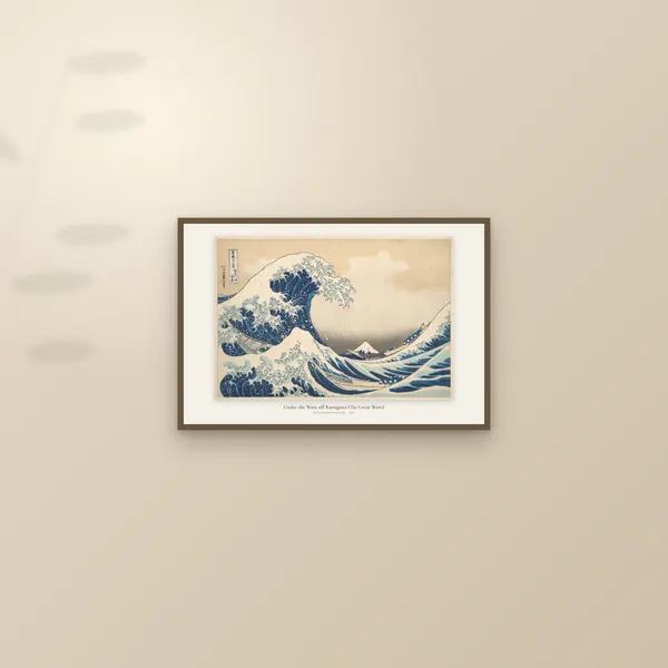
The Great Wave is a Japanese woodblock print by Katsushika Hokusai, designed around 1830 to 1832. Its full title is Under the Wave off Kanagawa, and it opens his series Thirty-six Views of Mount Fuji. It was made to sell: a cheap, bright picture of Japan's sacred mountain for a city crowd, printed in a new imported blue. Thousands of sheets were pulled from the same blocks, which is why there is no single original, why no two copies look quite alike, and why choosing a print of it is a real decision. This piece covers what it shows, how it was printed, where the best impressions are, and how to pick between the versions we sell.
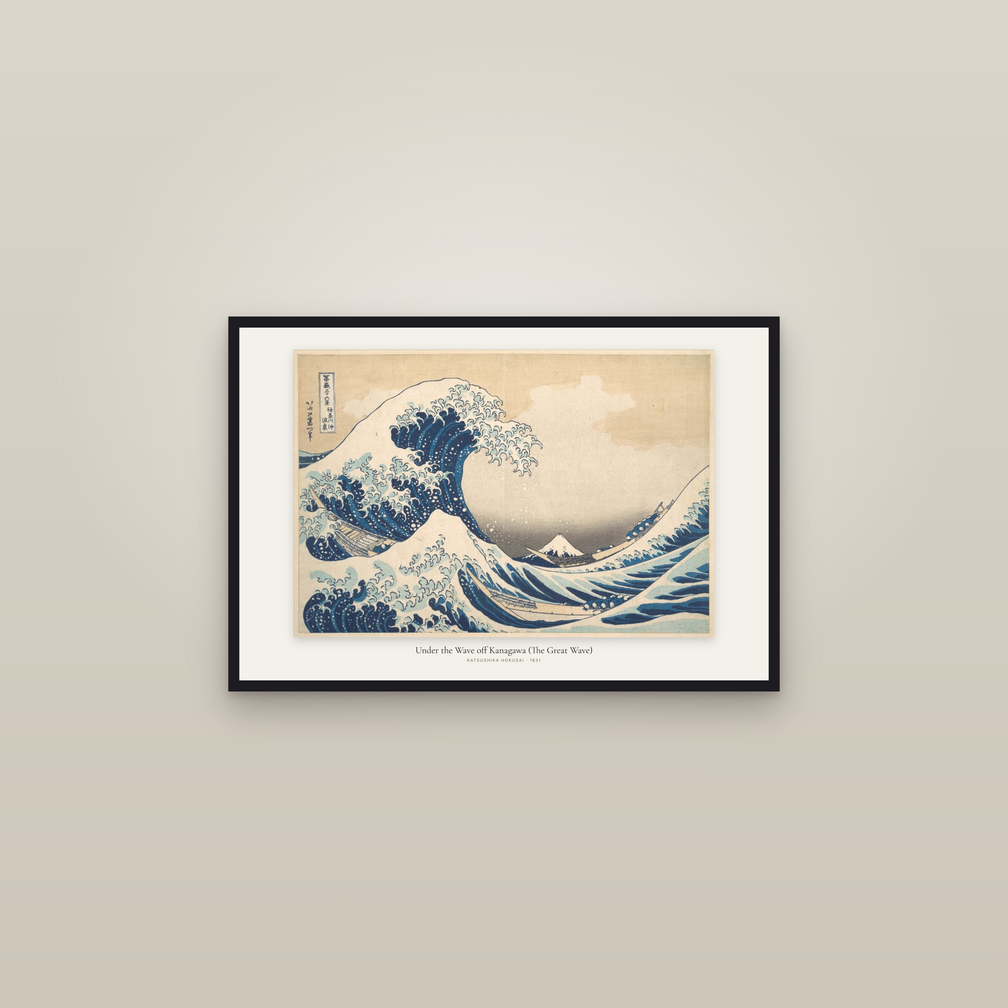
What does The Great Wave show?
A wave about to break. It rises from the left, its crest splitting into curling fingers of foam that reach over the sea. Below it, three long, narrow boats ride the swell, their crews crouched low over the oars. Far off, framed in the hollow under the crest, sits Mount Fuji, white-capped and tiny.
That small mountain is the point. The Metropolitan Museum of Art says Hokusai "cleverly played with perspective to make Japan's grandest mountain appear as a small triangular mound within the hollow of the cresting wave." The series promised thirty-six views of Fuji, and here the mountain is almost hidden by water.
Look at the top left corner and you'll find two small panels of text. The boxed one is the title cartouche, naming the series and the view. Beside it is the signature, which the Met reads as Zen Hokusai Iitsu hitsu. Iitsu was the name he was using at the time, and the publisher's advertisement for the series uses it too.
Who made it, and why?
Hokusai designed it, but a publisher paid for it and sold it. The firm was Eijudō, run by Nishimura Yohachi. Just before the New Year of 1831, the Met's scientist Marco Leona writes, Eijudō advertised the series as prints of Japan's most sacred mountain featuring "an exotic pigment newly available for the print market: Prussian blue."
The advertisement survives. A 2020 study in Heritage Science quotes it: "Thirty-Six Views of Mt. Fuji, by Zen Hokusai Iitsu; single-sheet aizuri. One view to each sheet, to be published one after the other." Aizuri means a picture printed in blue. The colour itself was the selling point.
Hokusai was not young. The Art Institute of Chicago notes that the series was begun in 1830, when he was 70, and says it established the popularity of landscape prints. The original thirty-six designs sold well enough that ten more followed in the mid-1830s, according to the Heritage Science authors. Those later ten have black outlines. The first thirty-six, the Great Wave among them, have blue ones.
How was it printed?
By hand, from carved wooden blocks, one colour at a time. Hokusai drew the design. A carver pasted the drawing face down on a wood block and cut away everything that was not a line. Further blocks were cut for each colour. A printer brushed pigment onto each block in turn, laid damp paper on top and rubbed the back with a round pad called a baren. No press was used. Our piece on Japanese woodblock printing walks through each stage.
The Great Wave's printers did something clever with the blue. The Met's scientists found that they mixed Prussian blue with the older plant dye indigo for the outlines. In the hollow of the wave they printed dark stripes first, then ran pure Prussian blue over them. Where the two layers overlap, the blue goes deep and dark. Where only one sits, it stays bright. That shift is what makes the wall of water seem to curve.
The double printing left a physical trace. Rubbing presses the paper into the block, so the carved shapes bite into it. Under a 3-D microscope, the Met found the white foam, the bright blue and the deep blue sitting at different heights. Hold a good impression to the light and the wave has real relief.
How many Great Waves are there?
Nobody counted. There was no fixed edition: the publisher printed for as long as people bought. The Heritage Science authors estimate about two hundred prints could be pulled in a day, and that a popular print could be reissued "in as many as several thousand impressions." They also say a series this popular was probably reprinted well beyond its original production.
So "the original Great Wave" is a family of sheets, not one object. Each sheet is called an impression. Capucine Korenberg, a scientist at the British Museum, compared photographs of 111 of them to work out the order they were printed in.
Why do no two impressions look the same?
Because they were printed over years, from wearing blocks, by different hands. Four things change from sheet to sheet.
- The lines wear. Each pass of the baren widens the printed lines a little and breaks tiny pieces off the thin ridges of wood. Korenberg found damage in eight places on the Great Wave's original key block, the block that prints the outlines.
- The colour blocks were replaced. The same study found the colour blocks were changed three times as the design went on being printed.
- The blue changed. The Heritage Science team measured the blue outlines on 141 prints of the series and sorted them into nine groups by their mix of indigo and Prussian blue. They treat each group as a separate production batch.
- Later printers cut corners. The first edition may have been printed with care, the same authors write, but as the audience grew, printers and publishers became "less conscientious about the application of color," sometimes leaving out colour blocks altogether.
Then there are the reprints. The Heritage Science study identifies some sheets as early-twentieth-century reproductions, printed from newly carved blocks with outlines in pure Prussian blue. The intensity of the pink in their sky and the cutting of the breaking wave give them away.
And light does the rest. Indigo "is known for being less lightfast than Prussian blue," the study notes. A sheet that hung in a sunny room for decades can lose its softer colours while the Prussian blue holds.
Which impressions are the best, and where are they?
Early ones with clean lines and strong colour, and several famous museums own them. Here are three you can read about online.
| Museum | Impressions | What the museum says |
|---|---|---|
| The Metropolitan Museum of Art, New York | Four | The Heritage Science authors say the two best are "widely considered to be among the earliest impressions of the Great Wave." Leona wrote in 2020 that JP1847, the one we print from, "was probably one of the earliest." |
| Art Institute of Chicago | Three | All three "are later impressions than the first state of the design." |
| British Museum, London | 2008,3008.1.JA, among others | Korenberg's 2020 article illustrates this impression. |
There's a catch if you want to see one. The Met's record of JP1847 says "Not on view", and the Art Institute lists none of its three as on view. In 2017 the University of Bradford and the British Museum ran microfading tests on the Great Wave and Red Fuji, shining a tiny spot of bright light on the prints and measuring the fading. Their advice was to show the prints no more than 20 per cent of the time, and only in dim light. So on most days, the finest impressions are in storage.
Why is it so famous?
Partly because Europe saw it early. After Japan opened to Western trade in the 1850s, Japanese art became a craze in France, and painters such as Monet owned Hokusai prints, the Met notes. The composer Claude Debussy kept a framed print of the Great Wave on his studio wall, and it can be seen behind him in a 1910 photograph taken by Igor Stravinsky. In 1905 Debussy put a cropped detail of the wave on the cover of the first edition of his orchestral piece La Mer. He placed his own name where Hokusai's sits on the print, up in the sky above the wave. The Met's label also says the print is "said to have inspired" Rilke's poem Der Berg.
Partly because it works at any size. It reads at a glance as a postcard and holds up to close looking on a wall. It has been copied so often that it is on our list of the most reproduced artworks.
Which version should you buy?
We print one impression, the Met's JP1847, in three ways. All three print on 250 gsm archival paper, unframed or in a black or dark wood frame, and the edge-to-edge version also comes on canvas.
| Version | What you see | Shape | Sizes (inches) | Canvas |
|---|---|---|---|---|
| Gallery print | The whole sheet, uncropped, on a pale ground, with the title and "Katsushika Hokusai · 1831" set beneath | Landscape | 18 × 12, 24 × 16 | No |
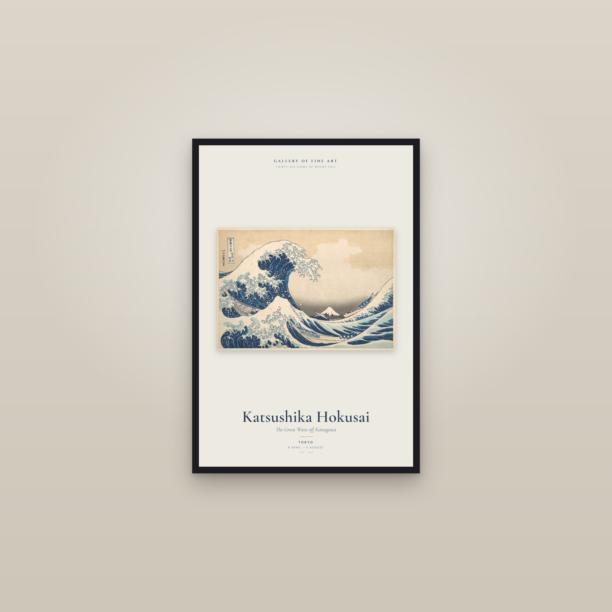
| Exhibition poster | The whole sheet on a cream ground, with Hokusai's name and the title in large type below it | Portrait | 12 × 18, 16 × 24, 24 × 36 | No |
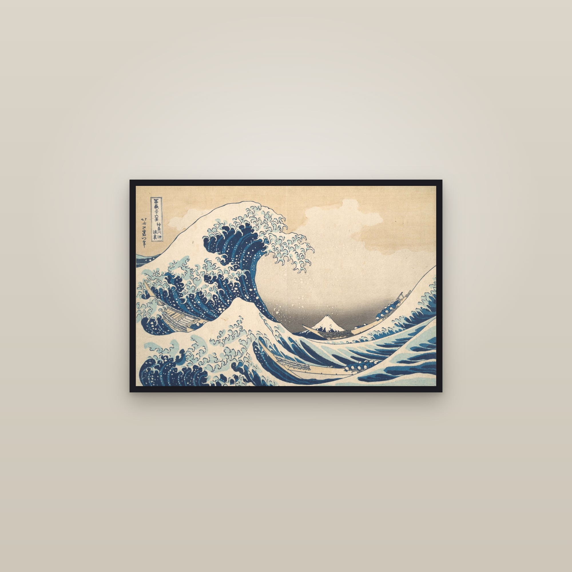
| Edge to edge | The print filling the sheet, very slightly cropped at the edges | Landscape | 18 × 12, 24 × 16 | Yes |
Gallery print choose this if you want it to look like what it is, a Japanese print with its margins, cartouche and signature intact. It suits a wide space above a sofa, a desk or a sideboard. At 24 by 16 inches it is the largest size the scan holds sharply.
Exhibition poster choose this for a tall, narrow wall, a hallway, or for the biggest piece. It is the only portrait version and the only one at 24 by 36 inches. The lettering is styled on museum exhibition posters. The venue and dates in the type are part of the design, not a real show.
Edge to edge choose this if you want the wave itself as large as the sheet allows, or if you want canvas. At 24 by 16 inches the wave is about one and a half times the size Hokusai's printers pulled it. The crop takes only a sliver off each edge, and the cartouche, the signature and all three boats stay in.
A note on size. The Met's sheet measures 25.7 by 37.9 cm, about 10 by 15 inches. Every size we sell is larger than the original. If you are unsure which size fits your wall, our guide to print sizes and ratios explains the shapes, and framed, unframed or canvas covers the finish.
What goes well with it?
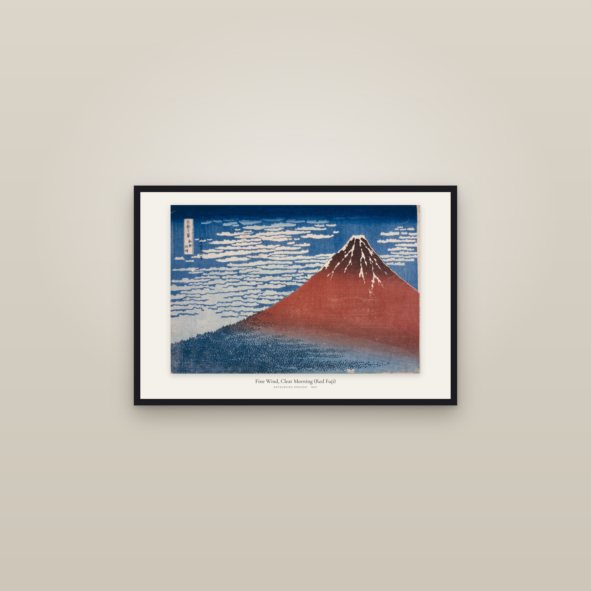
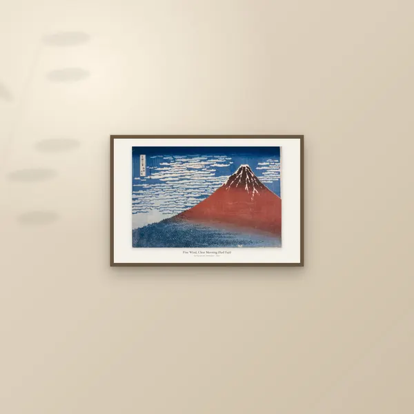
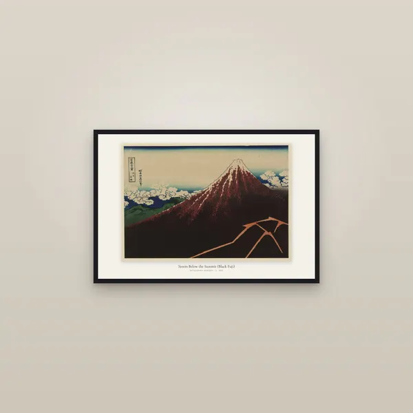
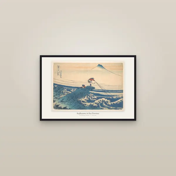
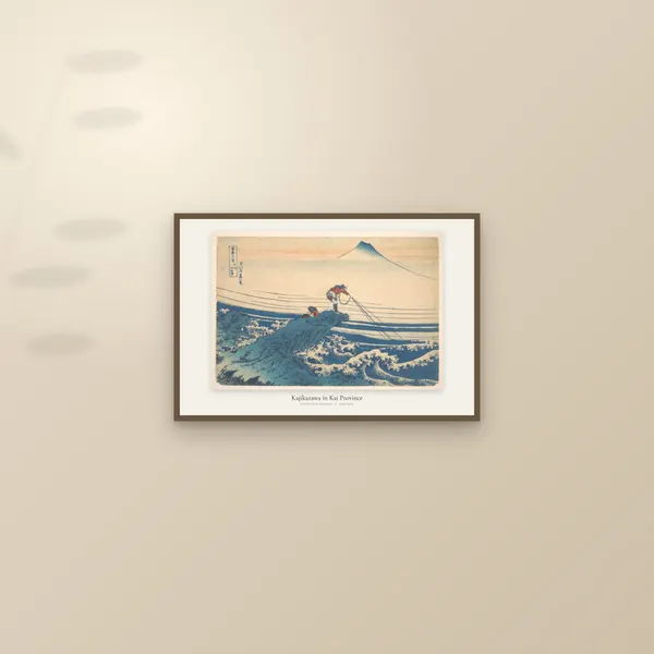
Other views from the same series, which share its blues and its size. Red Fuji is the obvious pair: the mountain fills that sheet, where here it nearly vanishes. Rainstorm Beneath the Summit is the darker third. Kajikazawa in Kai Province, with its lone fisherman on a rock above the spray, carries the same mood of a person against water. The whole series is in Thirty-six Views of Mount Fuji, and the rest of his work in Hokusai prints.


Questions people ask
Is The Great Wave a painting?
No. It is a colour woodblock print, made around 1830 to 1832 by a publisher's workshop from Hokusai's design. A carver cut the blocks and printers pulled the sheets by hand, so many copies, called impressions, exist.
How many copies of The Great Wave were made?
Nobody kept a count. A 2020 study in Heritage Science says a popular print could be reissued in as many as several thousand impressions, and that the series was probably reprinted well beyond its first run. Capucine Korenberg of the British Museum compared photographs of 111 surviving impressions.
Where is the original Great Wave?
There isn't one original. Many museums own impressions, including the Metropolitan Museum of Art in New York (four), the Art Institute of Chicago (three) and the British Museum. Because the pigments fade in light, they are rarely on display; check the museum's page before you go.
Why do Great Wave prints look different from each other?
They were printed over years. The key block wore and was damaged in eight places, the colour blocks were changed three times, the mix of indigo and Prussian blue varied from batch to batch, and later printers took less care. Light then fades some colours more than others.
What is the blue in The Great Wave?
Mostly Prussian blue, a synthetic pigment that had recently become available in Japan, mixed with or printed over the older plant dye indigo. The Met found the darkest blues were printed twice, one layer over the other.
Which Great Wave print should I buy?
For a landscape wall, the gallery print shows the whole sheet, cartouche and signature included. For a tall space or a bigger size, the exhibition poster is portrait and goes to 24 by 36 inches. For the wave as large as possible, or on canvas, choose the edge-to-edge print, which is very slightly cropped.
How big is the real Great Wave?
The Met's impression measures 25.7 by 37.9 cm, about 10 by 15 inches. Every print size we sell is larger than that.
Sources
- The Metropolitan Museum of Art: Under the Wave off Kanagawa (The Great Wave), JP1847 (date, medium, size, signature, label, H. O. Havemeyer bequest, 1929)
- Marco Leona, The Metropolitan Museum of Art, 10 April 2020: The Great Wave, anatomy of an icon (the New Year 1831 advertisement, Prussian blue and indigo, double printing, relief in the paper, an early impression)
- Vermeulen, Burgio, Leona et al., npj Heritage Science 8:62 (2020): a chronology of 141 Hokusai prints (Prussian blue, the publisher's advertisement, several thousand impressions, wear, the Met's four impressions, twentieth-century reprints, indigo less lightfast)
- Sainsbury Institute e-Bulletin, November 2020: Capucine Korenberg, The making and evolution of Hokusai's Great Wave (111 photographs, key-block damage in eight places, colour blocks changed three times)
- Art Institute of Chicago: Under the Wave off Kanagawa, 1925.3245 (series begun in 1830 when Hokusai was 70; Berlin blue; three impressions, all later than the first state)
- University of Bradford, 19 July 2017: Preserving iconic Japanese art (microfading tests on The Great Wave and Red Fuji with the British Museum; display no more than 20 per cent of the time, in dim light)
- The Metropolitan Museum of Art, Perspectives, 22 July 2014: Hokusai and Debussy's evocations of the sea (the print on Debussy's wall, the 1905 La Mer cover)
Start hereA short history of the print, from woodblock to giclée